class: inverse, bottom background-image: url(https://images.unsplash.com/photo-1559827260-dc66d52bef19?ixlib=rb-4.0.3&ixid=M3wxMjA3fDB8MHxwaG90by1wYWdlfHx8fGVufDB8fHx8fA%3D%3D&auto=format&fit=crop&w=1470&q=80) background-size: cover # .Large[Who are the ggplot2 extenders] ## .large[And how to become one...] #### .small[Evangeline 'Gina' Reynolds \| 2025-08-05 \| JSM, Nashville, Image credit: Silas Baisch, Upsplash] --- # Part 00. Why ggplot2 -- # Part 0. Why extension? -- # Part 1. Who are the ggplot2 extenders -- # Part 2. How to become an extender. --- class: inverse ## Part 00. Why ggplot2 > ### 'ggplot2 continues to be the best thing ever.' Dewey Dunningham -- > ### "the Grammar of Graphics makes [building plots] easy because you've just got all these, like, little nice decomposable components" -- Hadley Wickham -- > ### 'ggplot2 let's you speak your plots into existence.' -- Thomas Lin Pedersen --- class: inverse # On motivation: > ### And, you know, I'd get a dataset. And, *in my head I could very clearly kind of picture*, I want to put this on the x-axis. Let's put this on the y-axis, draw a line, put some points here, break it up by this variable. -- > ### And then, like, getting that vision out of my head, and into reality, it's just really, really hard. Just, like, felt harder than it should be. Like, there's a lot of custom programming involved, --- class: inverse > ### where I just felt, like, to me, I just wanted to say, like, you know, *this is what I'm thinking, this is how I'm picturing this plot. Like you're the computer 'Go and do it'.* -- > ### ... and I'd also been reading about the Grammar of Graphics by Leland Wilkinson, I got to meet him a couple of times and ... I was, like, this book has been, like, written for me. <https://www.trifacta.com/podcast/tidy-data-with-hadley-wickham/> --- count: false ## ggplot2 nails it... .panel1-scatter-auto[ ``` r *gapminder_2002 ``` ] .panel2-scatter-auto[ ``` ## # A tibble: 142 × 6 ## country continent year lifeExp pop gdpPercap ## <fct> <fct> <int> <dbl> <int> <dbl> ## 1 Afghanistan Asia 2002 42.1 25268405 727. ## 2 Albania Europe 2002 75.7 3508512 4604. ## 3 Algeria Africa 2002 71.0 31287142 5288. ## 4 Angola Africa 2002 41.0 10866106 2773. ## 5 Argentina Americas 2002 74.3 38331121 8798. ## 6 Australia Oceania 2002 80.4 19546792 30688. ## 7 Austria Europe 2002 79.0 8148312 32418. ## 8 Bahrain Asia 2002 74.8 656397 23404. ## 9 Bangladesh Asia 2002 62.0 135656790 1136. ## 10 Belgium Europe 2002 78.3 10311970 30486. ## # ℹ 132 more rows ``` ] --- count: false ## ggplot2 nails it... .panel1-scatter-auto[ ``` r gapminder_2002 |> * ggplot() ``` ] .panel2-scatter-auto[ <!-- --> ] --- count: false ## ggplot2 nails it... .panel1-scatter-auto[ ``` r gapminder_2002 |> ggplot() + * aes(x = gdpPercap) ``` ] .panel2-scatter-auto[ <!-- --> ] --- count: false ## ggplot2 nails it... .panel1-scatter-auto[ ``` r gapminder_2002 |> ggplot() + aes(x = gdpPercap) + * aes(y = lifeExp) ``` ] .panel2-scatter-auto[ <!-- --> ] --- count: false ## ggplot2 nails it... .panel1-scatter-auto[ ``` r gapminder_2002 |> ggplot() + aes(x = gdpPercap) + aes(y = lifeExp) + * geom_point() ``` ] .panel2-scatter-auto[ <!-- --> ] --- count: false ## ggplot2 nails it... .panel1-scatter-auto[ ``` r gapminder_2002 |> ggplot() + aes(x = gdpPercap) + aes(y = lifeExp) + geom_point() + * geom_smooth() ``` ] .panel2-scatter-auto[ <!-- --> ] --- count: false ## ggplot2 nails it... .panel1-scatter-auto[ ``` r gapminder_2002 |> ggplot() + aes(x = gdpPercap) + aes(y = lifeExp) + geom_point() + geom_smooth() + * facet_wrap(vars(continent)) ``` ] .panel2-scatter-auto[ 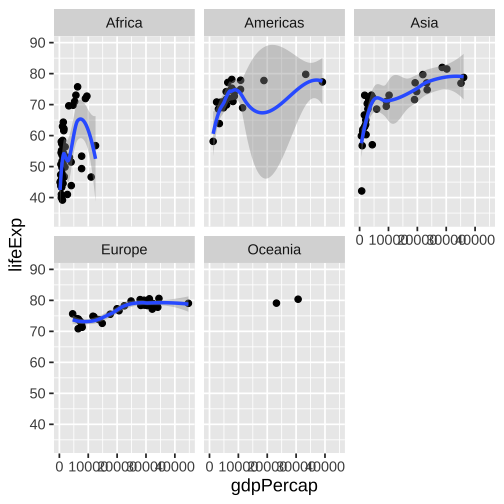<!-- --> ] <style> .panel1-scatter-auto { color: black; width: 39.2%; hight: 32%; float: left; padding-left: 1%; font-size: 80% } .panel2-scatter-auto { color: black; width: 58.8%; hight: 32%; float: left; padding-left: 1%; font-size: 80% } .panel3-scatter-auto { color: black; width: NA%; hight: 33%; float: left; padding-left: 1%; font-size: 80% } </style> --- class: inverse, center, middle # staccato. -- graphical. -- poem. --- ### Part 0. Why extension? -- Sometimes it's not like that. -- What's the graphical poem here? 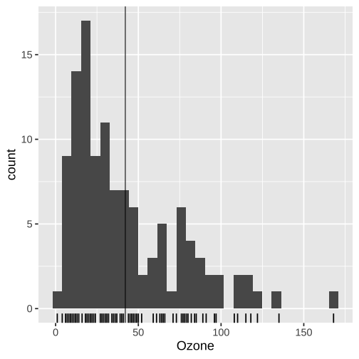<!-- --> ??? Consider for example, a the seemingly simple enterprise of adding a vertical line at the mean of x, perhaps atop a histogram or density plot. --- count: false ### What's the *base* ggplot2 experience .panel1-basic-auto[ ``` r *airquality ``` ] .panel2-basic-auto[ ``` ## Ozone Solar.R Wind Temp Month Day ## 1 41 190 7.4 67 5 1 ## 2 36 118 8.0 72 5 2 ## 3 12 149 12.6 74 5 3 ## 4 18 313 11.5 62 5 4 ## 5 NA NA 14.3 56 5 5 ## 6 28 NA 14.9 66 5 6 ## 7 23 299 8.6 65 5 7 ## 8 19 99 13.8 59 5 8 ## 9 8 19 20.1 61 5 9 ## 10 NA 194 8.6 69 5 10 ## 11 7 NA 6.9 74 5 11 ## 12 16 256 9.7 69 5 12 ## 13 11 290 9.2 66 5 13 ## 14 14 274 10.9 68 5 14 ## 15 18 65 13.2 58 5 15 ## 16 14 334 11.5 64 5 16 ## 17 34 307 12.0 66 5 17 ## 18 6 78 18.4 57 5 18 ## 19 30 322 11.5 68 5 19 ## 20 11 44 9.7 62 5 20 ## 21 1 8 9.7 59 5 21 ## 22 11 320 16.6 73 5 22 ## 23 4 25 9.7 61 5 23 ## 24 32 92 12.0 61 5 24 ## 25 NA 66 16.6 57 5 25 ## 26 NA 266 14.9 58 5 26 ## 27 NA NA 8.0 57 5 27 ## 28 23 13 12.0 67 5 28 ## 29 45 252 14.9 81 5 29 ## 30 115 223 5.7 79 5 30 ## 31 37 279 7.4 76 5 31 ## 32 NA 286 8.6 78 6 1 ## 33 NA 287 9.7 74 6 2 ## 34 NA 242 16.1 67 6 3 ## 35 NA 186 9.2 84 6 4 ## 36 NA 220 8.6 85 6 5 ## 37 NA 264 14.3 79 6 6 ## 38 29 127 9.7 82 6 7 ## 39 NA 273 6.9 87 6 8 ## 40 71 291 13.8 90 6 9 ## 41 39 323 11.5 87 6 10 ## 42 NA 259 10.9 93 6 11 ## 43 NA 250 9.2 92 6 12 ## 44 23 148 8.0 82 6 13 ## 45 NA 332 13.8 80 6 14 ## 46 NA 322 11.5 79 6 15 ## 47 21 191 14.9 77 6 16 ## 48 37 284 20.7 72 6 17 ## 49 20 37 9.2 65 6 18 ## 50 12 120 11.5 73 6 19 ## 51 13 137 10.3 76 6 20 ## 52 NA 150 6.3 77 6 21 ## 53 NA 59 1.7 76 6 22 ## 54 NA 91 4.6 76 6 23 ## 55 NA 250 6.3 76 6 24 ## 56 NA 135 8.0 75 6 25 ## 57 NA 127 8.0 78 6 26 ## 58 NA 47 10.3 73 6 27 ## 59 NA 98 11.5 80 6 28 ## 60 NA 31 14.9 77 6 29 ## 61 NA 138 8.0 83 6 30 ## 62 135 269 4.1 84 7 1 ## 63 49 248 9.2 85 7 2 ## 64 32 236 9.2 81 7 3 ## 65 NA 101 10.9 84 7 4 ## 66 64 175 4.6 83 7 5 ## 67 40 314 10.9 83 7 6 ## 68 77 276 5.1 88 7 7 ## 69 97 267 6.3 92 7 8 ## 70 97 272 5.7 92 7 9 ## 71 85 175 7.4 89 7 10 ## 72 NA 139 8.6 82 7 11 ## 73 10 264 14.3 73 7 12 ## 74 27 175 14.9 81 7 13 ## 75 NA 291 14.9 91 7 14 ## 76 7 48 14.3 80 7 15 ## 77 48 260 6.9 81 7 16 ## 78 35 274 10.3 82 7 17 ## 79 61 285 6.3 84 7 18 ## 80 79 187 5.1 87 7 19 ## 81 63 220 11.5 85 7 20 ## 82 16 7 6.9 74 7 21 ## 83 NA 258 9.7 81 7 22 ## 84 NA 295 11.5 82 7 23 ## 85 80 294 8.6 86 7 24 ## 86 108 223 8.0 85 7 25 ## 87 20 81 8.6 82 7 26 ## 88 52 82 12.0 86 7 27 ## 89 82 213 7.4 88 7 28 ## 90 50 275 7.4 86 7 29 ## 91 64 253 7.4 83 7 30 ## 92 59 254 9.2 81 7 31 ## 93 39 83 6.9 81 8 1 ## 94 9 24 13.8 81 8 2 ## 95 16 77 7.4 82 8 3 ## 96 78 NA 6.9 86 8 4 ## 97 35 NA 7.4 85 8 5 ## 98 66 NA 4.6 87 8 6 ## 99 122 255 4.0 89 8 7 ## 100 89 229 10.3 90 8 8 ## 101 110 207 8.0 90 8 9 ## 102 NA 222 8.6 92 8 10 ## 103 NA 137 11.5 86 8 11 ## 104 44 192 11.5 86 8 12 ## 105 28 273 11.5 82 8 13 ## 106 65 157 9.7 80 8 14 ## 107 NA 64 11.5 79 8 15 ## 108 22 71 10.3 77 8 16 ## 109 59 51 6.3 79 8 17 ## 110 23 115 7.4 76 8 18 ## 111 31 244 10.9 78 8 19 ## 112 44 190 10.3 78 8 20 ## 113 21 259 15.5 77 8 21 ## 114 9 36 14.3 72 8 22 ## 115 NA 255 12.6 75 8 23 ## 116 45 212 9.7 79 8 24 ## 117 168 238 3.4 81 8 25 ## 118 73 215 8.0 86 8 26 ## 119 NA 153 5.7 88 8 27 ## 120 76 203 9.7 97 8 28 ## 121 118 225 2.3 94 8 29 ## 122 84 237 6.3 96 8 30 ## 123 85 188 6.3 94 8 31 ## 124 96 167 6.9 91 9 1 ## 125 78 197 5.1 92 9 2 ## 126 73 183 2.8 93 9 3 ## 127 91 189 4.6 93 9 4 ## 128 47 95 7.4 87 9 5 ## 129 32 92 15.5 84 9 6 ## 130 20 252 10.9 80 9 7 ## 131 23 220 10.3 78 9 8 ## 132 21 230 10.9 75 9 9 ## 133 24 259 9.7 73 9 10 ## 134 44 236 14.9 81 9 11 ## 135 21 259 15.5 76 9 12 ## 136 28 238 6.3 77 9 13 ## 137 9 24 10.9 71 9 14 ## 138 13 112 11.5 71 9 15 ## 139 46 237 6.9 78 9 16 ## 140 18 224 13.8 67 9 17 ## 141 13 27 10.3 76 9 18 ## 142 24 238 10.3 68 9 19 ## 143 16 201 8.0 82 9 20 ## 144 13 238 12.6 64 9 21 ## 145 23 14 9.2 71 9 22 ## 146 36 139 10.3 81 9 23 ## 147 7 49 10.3 69 9 24 ## 148 14 20 16.6 63 9 25 ## 149 30 193 6.9 70 9 26 ## 150 NA 145 13.2 77 9 27 ## 151 14 191 14.3 75 9 28 ## 152 18 131 8.0 76 9 29 ## 153 20 223 11.5 68 9 30 ``` ] --- count: false ### What's the *base* ggplot2 experience .panel1-basic-auto[ ``` r airquality %>% * ggplot(data = .) ``` ] .panel2-basic-auto[ <!-- --> ] --- count: false ### What's the *base* ggplot2 experience .panel1-basic-auto[ ``` r airquality %>% ggplot(data = .) + * aes(x = Ozone) ``` ] .panel2-basic-auto[ <!-- --> ] --- count: false ### What's the *base* ggplot2 experience .panel1-basic-auto[ ``` r airquality %>% ggplot(data = .) + aes(x = Ozone) + * geom_rug() ``` ] .panel2-basic-auto[ <!-- --> ] --- count: false ### What's the *base* ggplot2 experience .panel1-basic-auto[ ``` r airquality %>% ggplot(data = .) + aes(x = Ozone) + geom_rug() + * geom_histogram() ``` ] .panel2-basic-auto[ <!-- --> ] --- count: false ### What's the *base* ggplot2 experience .panel1-basic-auto[ ``` r airquality %>% ggplot(data = .) + aes(x = Ozone) + geom_rug() + geom_histogram() + * geom_vline( * xintercept = * mean(airquality$Ozone, * na.rm = T) * ) ``` ] .panel2-basic-auto[ <!-- --> ] --- count: false ### What's the *base* ggplot2 experience .panel1-basic-auto[ ``` r airquality %>% ggplot(data = .) + aes(x = Ozone) + geom_rug() + geom_histogram() + geom_vline( xintercept = mean(airquality$Ozone, na.rm = T) ) -> *g ``` ] .panel2-basic-auto[ ] <style> .panel1-basic-auto { color: black; width: 38.6060606060606%; hight: 32%; float: left; padding-left: 1%; font-size: 80% } .panel2-basic-auto { color: black; width: 59.3939393939394%; hight: 32%; float: left; padding-left: 1%; font-size: 80% } .panel3-basic-auto { color: black; width: NA%; hight: 33%; float: left; padding-left: 1%; font-size: 80% } </style> ??? Creating this plot requires greater focus on ggplot2 *syntax*, likely detracting from discussion of *the mean* that statistical instructors desire. It may require a discussion about dollar sign syntax and how geom_vline is actually a special geom -- an annotation -- rather than being mapped to the data. None of this is relevant to the point you as an instructor aim to make: maybe that the the mean is the balancing point of the data or maybe a comment about skewness. --- ### Adding the conditional means? <!-- --> --- count: false .panel1-cond_means_hard-auto[ ``` r *airquality ``` ] .panel2-cond_means_hard-auto[ ``` ## Ozone Solar.R Wind Temp Month Day ## 1 41 190 7.4 67 5 1 ## 2 36 118 8.0 72 5 2 ## 3 12 149 12.6 74 5 3 ## 4 18 313 11.5 62 5 4 ## 5 NA NA 14.3 56 5 5 ## 6 28 NA 14.9 66 5 6 ## 7 23 299 8.6 65 5 7 ## 8 19 99 13.8 59 5 8 ## 9 8 19 20.1 61 5 9 ## 10 NA 194 8.6 69 5 10 ## 11 7 NA 6.9 74 5 11 ## 12 16 256 9.7 69 5 12 ## 13 11 290 9.2 66 5 13 ## 14 14 274 10.9 68 5 14 ## 15 18 65 13.2 58 5 15 ## 16 14 334 11.5 64 5 16 ## 17 34 307 12.0 66 5 17 ## 18 6 78 18.4 57 5 18 ## 19 30 322 11.5 68 5 19 ## 20 11 44 9.7 62 5 20 ## 21 1 8 9.7 59 5 21 ## 22 11 320 16.6 73 5 22 ## 23 4 25 9.7 61 5 23 ## 24 32 92 12.0 61 5 24 ## 25 NA 66 16.6 57 5 25 ## 26 NA 266 14.9 58 5 26 ## 27 NA NA 8.0 57 5 27 ## 28 23 13 12.0 67 5 28 ## 29 45 252 14.9 81 5 29 ## 30 115 223 5.7 79 5 30 ## 31 37 279 7.4 76 5 31 ## 32 NA 286 8.6 78 6 1 ## 33 NA 287 9.7 74 6 2 ## 34 NA 242 16.1 67 6 3 ## 35 NA 186 9.2 84 6 4 ## 36 NA 220 8.6 85 6 5 ## 37 NA 264 14.3 79 6 6 ## 38 29 127 9.7 82 6 7 ## 39 NA 273 6.9 87 6 8 ## 40 71 291 13.8 90 6 9 ## 41 39 323 11.5 87 6 10 ## 42 NA 259 10.9 93 6 11 ## 43 NA 250 9.2 92 6 12 ## 44 23 148 8.0 82 6 13 ## 45 NA 332 13.8 80 6 14 ## 46 NA 322 11.5 79 6 15 ## 47 21 191 14.9 77 6 16 ## 48 37 284 20.7 72 6 17 ## 49 20 37 9.2 65 6 18 ## 50 12 120 11.5 73 6 19 ## 51 13 137 10.3 76 6 20 ## 52 NA 150 6.3 77 6 21 ## 53 NA 59 1.7 76 6 22 ## 54 NA 91 4.6 76 6 23 ## 55 NA 250 6.3 76 6 24 ## 56 NA 135 8.0 75 6 25 ## 57 NA 127 8.0 78 6 26 ## 58 NA 47 10.3 73 6 27 ## 59 NA 98 11.5 80 6 28 ## 60 NA 31 14.9 77 6 29 ## 61 NA 138 8.0 83 6 30 ## 62 135 269 4.1 84 7 1 ## 63 49 248 9.2 85 7 2 ## 64 32 236 9.2 81 7 3 ## 65 NA 101 10.9 84 7 4 ## 66 64 175 4.6 83 7 5 ## 67 40 314 10.9 83 7 6 ## 68 77 276 5.1 88 7 7 ## 69 97 267 6.3 92 7 8 ## 70 97 272 5.7 92 7 9 ## 71 85 175 7.4 89 7 10 ## 72 NA 139 8.6 82 7 11 ## 73 10 264 14.3 73 7 12 ## 74 27 175 14.9 81 7 13 ## 75 NA 291 14.9 91 7 14 ## 76 7 48 14.3 80 7 15 ## 77 48 260 6.9 81 7 16 ## 78 35 274 10.3 82 7 17 ## 79 61 285 6.3 84 7 18 ## 80 79 187 5.1 87 7 19 ## 81 63 220 11.5 85 7 20 ## 82 16 7 6.9 74 7 21 ## 83 NA 258 9.7 81 7 22 ## 84 NA 295 11.5 82 7 23 ## 85 80 294 8.6 86 7 24 ## 86 108 223 8.0 85 7 25 ## 87 20 81 8.6 82 7 26 ## 88 52 82 12.0 86 7 27 ## 89 82 213 7.4 88 7 28 ## 90 50 275 7.4 86 7 29 ## 91 64 253 7.4 83 7 30 ## 92 59 254 9.2 81 7 31 ## 93 39 83 6.9 81 8 1 ## 94 9 24 13.8 81 8 2 ## 95 16 77 7.4 82 8 3 ## 96 78 NA 6.9 86 8 4 ## 97 35 NA 7.4 85 8 5 ## 98 66 NA 4.6 87 8 6 ## 99 122 255 4.0 89 8 7 ## 100 89 229 10.3 90 8 8 ## 101 110 207 8.0 90 8 9 ## 102 NA 222 8.6 92 8 10 ## 103 NA 137 11.5 86 8 11 ## 104 44 192 11.5 86 8 12 ## 105 28 273 11.5 82 8 13 ## 106 65 157 9.7 80 8 14 ## 107 NA 64 11.5 79 8 15 ## 108 22 71 10.3 77 8 16 ## 109 59 51 6.3 79 8 17 ## 110 23 115 7.4 76 8 18 ## 111 31 244 10.9 78 8 19 ## 112 44 190 10.3 78 8 20 ## 113 21 259 15.5 77 8 21 ## 114 9 36 14.3 72 8 22 ## 115 NA 255 12.6 75 8 23 ## 116 45 212 9.7 79 8 24 ## 117 168 238 3.4 81 8 25 ## 118 73 215 8.0 86 8 26 ## 119 NA 153 5.7 88 8 27 ## 120 76 203 9.7 97 8 28 ## 121 118 225 2.3 94 8 29 ## 122 84 237 6.3 96 8 30 ## 123 85 188 6.3 94 8 31 ## 124 96 167 6.9 91 9 1 ## 125 78 197 5.1 92 9 2 ## 126 73 183 2.8 93 9 3 ## 127 91 189 4.6 93 9 4 ## 128 47 95 7.4 87 9 5 ## 129 32 92 15.5 84 9 6 ## 130 20 252 10.9 80 9 7 ## 131 23 220 10.3 78 9 8 ## 132 21 230 10.9 75 9 9 ## 133 24 259 9.7 73 9 10 ## 134 44 236 14.9 81 9 11 ## 135 21 259 15.5 76 9 12 ## 136 28 238 6.3 77 9 13 ## 137 9 24 10.9 71 9 14 ## 138 13 112 11.5 71 9 15 ## 139 46 237 6.9 78 9 16 ## 140 18 224 13.8 67 9 17 ## 141 13 27 10.3 76 9 18 ## 142 24 238 10.3 68 9 19 ## 143 16 201 8.0 82 9 20 ## 144 13 238 12.6 64 9 21 ## 145 23 14 9.2 71 9 22 ## 146 36 139 10.3 81 9 23 ## 147 7 49 10.3 69 9 24 ## 148 14 20 16.6 63 9 25 ## 149 30 193 6.9 70 9 26 ## 150 NA 145 13.2 77 9 27 ## 151 14 191 14.3 75 9 28 ## 152 18 131 8.0 76 9 29 ## 153 20 223 11.5 68 9 30 ``` ] --- count: false .panel1-cond_means_hard-auto[ ``` r airquality %>% * group_by(Month) ``` ] .panel2-cond_means_hard-auto[ ``` ## # A tibble: 153 × 6 ## # Groups: Month [5] ## Ozone Solar.R Wind Temp Month Day ## <int> <int> <dbl> <int> <int> <int> ## 1 41 190 7.4 67 5 1 ## 2 36 118 8 72 5 2 ## 3 12 149 12.6 74 5 3 ## 4 18 313 11.5 62 5 4 ## 5 NA NA 14.3 56 5 5 ## 6 28 NA 14.9 66 5 6 ## 7 23 299 8.6 65 5 7 ## 8 19 99 13.8 59 5 8 ## 9 8 19 20.1 61 5 9 ## 10 NA 194 8.6 69 5 10 ## # ℹ 143 more rows ``` ] --- count: false .panel1-cond_means_hard-auto[ ``` r airquality %>% group_by(Month) %>% * summarise( * Ozone_mean = * mean(Ozone, na.rm = T) * ) ``` ] .panel2-cond_means_hard-auto[ ``` ## # A tibble: 5 × 2 ## Month Ozone_mean ## <int> <dbl> ## 1 5 23.6 ## 2 6 29.4 ## 3 7 59.1 ## 4 8 60.0 ## 5 9 31.4 ``` ] --- count: false .panel1-cond_means_hard-auto[ ``` r airquality %>% group_by(Month) %>% summarise( Ozone_mean = mean(Ozone, na.rm = T) ) -> *airquality_by_month ``` ] .panel2-cond_means_hard-auto[ ] --- count: false .panel1-cond_means_hard-auto[ ``` r airquality %>% group_by(Month) %>% summarise( Ozone_mean = mean(Ozone, na.rm = T) ) -> airquality_by_month *ggplot(airquality) ``` ] .panel2-cond_means_hard-auto[ <!-- --> ] --- count: false .panel1-cond_means_hard-auto[ ``` r airquality %>% group_by(Month) %>% summarise( Ozone_mean = mean(Ozone, na.rm = T) ) -> airquality_by_month ggplot(airquality) + * aes(x = Ozone) ``` ] .panel2-cond_means_hard-auto[ <!-- --> ] --- count: false .panel1-cond_means_hard-auto[ ``` r airquality %>% group_by(Month) %>% summarise( Ozone_mean = mean(Ozone, na.rm = T) ) -> airquality_by_month ggplot(airquality) + aes(x = Ozone) + * geom_histogram() ``` ] .panel2-cond_means_hard-auto[ <!-- --> ] --- count: false .panel1-cond_means_hard-auto[ ``` r airquality %>% group_by(Month) %>% summarise( Ozone_mean = mean(Ozone, na.rm = T) ) -> airquality_by_month ggplot(airquality) + aes(x = Ozone) + geom_histogram() + * facet_grid(rows = vars(Month)) ``` ] .panel2-cond_means_hard-auto[ <!-- --> ] --- count: false .panel1-cond_means_hard-auto[ ``` r airquality %>% group_by(Month) %>% summarise( Ozone_mean = mean(Ozone, na.rm = T) ) -> airquality_by_month ggplot(airquality) + aes(x = Ozone) + geom_histogram() + facet_grid(rows = vars(Month)) + * geom_vline(data = airquality_by_month, * aes(xintercept = * Ozone_mean)) ``` ] .panel2-cond_means_hard-auto[ <!-- --> ] <style> .panel1-cond_means_hard-auto { color: black; width: 38.6060606060606%; hight: 32%; float: left; padding-left: 1%; font-size: 80% } .panel2-cond_means_hard-auto { color: black; width: 59.3939393939394%; hight: 32%; float: left; padding-left: 1%; font-size: 80% } .panel3-cond_means_hard-auto { color: black; width: NA%; hight: 33%; float: left; padding-left: 1%; font-size: 80% } </style> ??? Further, for the case of adding a vertical line at the mean for different subsets of the data, a different approach is required. This enterprise may take instructor/analyst/student on an even larger detour -- possibly googling, and maybe landing on the following stack overflow page where 11,000 analytics souls (some repeats to be sure) have landed: --- ### - This doesn't feel like the ggplot2 experience... -- ### - I actually have to really focus/think to write/read this plot composition... -- ### - but base ggplot2 would be really bloated if it tried to to everything for us. -- ### - Enter extension... --- count: false .panel1-extension_fix-auto[ ``` r *ggplot(airquality) ``` ] .panel2-extension_fix-auto[ <!-- --> ] --- count: false .panel1-extension_fix-auto[ ``` r ggplot(airquality) + * aes(x = Ozone) ``` ] .panel2-extension_fix-auto[ <!-- --> ] --- count: false .panel1-extension_fix-auto[ ``` r ggplot(airquality) + aes(x = Ozone) + * geom_histogram() ``` ] .panel2-extension_fix-auto[ <!-- --> ] --- count: false .panel1-extension_fix-auto[ ``` r ggplot(airquality) + aes(x = Ozone) + geom_histogram() + * ggxmean::geom_x_mean() ``` ] .panel2-extension_fix-auto[ <!-- --> ] --- count: false .panel1-extension_fix-auto[ ``` r ggplot(airquality) + aes(x = Ozone) + geom_histogram() + ggxmean::geom_x_mean() + * facet_grid(rows = vars(Month)) ``` ] .panel2-extension_fix-auto[ <!-- --> ] <style> .panel1-extension_fix-auto { color: black; width: 38.6060606060606%; hight: 32%; float: left; padding-left: 1%; font-size: 80% } .panel2-extension_fix-auto { color: black; width: 59.3939393939394%; hight: 32%; float: left; padding-left: 1%; font-size: 80% } .panel3-extension_fix-auto { color: black; width: NA%; hight: 33%; float: left; padding-left: 1%; font-size: 80% } </style> --- # Part 1. Who are the ggplot2 extenders? -- # I'm here to advertise a ggplot2 extension meetup/club/working group… --- # Also known as 'the ggplot2 extenders'  --- # So instead of answering Part I. 'who are the ggplot2 extenders?’ -- # as 'who has extended ggplot2’,  --- # So instead of answering Part I. ‘who are the ggplot2 extenders?’ # as ‘who has extended ggplot2’, # I’ll answer in the very specific sense, ‘what’s this new meet up/community’? --- ## ‘the ggplot2 extenders’ group has been meeting virtually since April 2022 -- ### Exists to facilitate conversations about extension experiences. -- ### Co-founded w/ June Choe and myself, and benefited from early and continued involvement of Teun van den Brand, current maintainer of ggplot2 -- ### Has heard from almost 30 extenders on their projects ---  --- ### Notable: David Sjoberg (ggbump), **June Choe (ggtrace),** Claus Wilke (cowplot, ggtext, ggridgeline), Di Cook (GGally), Thomas Lin Pedersen\* (patchwork) , Winston Chang\* (ggproto extension mechanism), Teun van den Brand (ggh4x, legendry, ggplot2 maintainer), and Hadley Wickham\* (ggplot2), **Cory Brunson (ggalluvial, order), Mitchell O’Hara-Wild (ggtime, distributional), Matthew Kay\* (ggdist, ggblend),** -- ### Speakers talk about motivations, challenges, equivocations, design decision — in general, extension journeys! -- #### \* recorded talks available on our website --- ## Since spring 2024, our between-meeting discussions has also been an exciting space to exchange ideas about extension strategies and design choices! -- ### - almost 100 discussions initiated -- ### - more than 1000 contributions -- ### - used to coordinate this panel - Thanks Joyce! --- {width="60%"} --- # But you may be thinking… -- ## ‘ggplot2 extenders’ … -- ## wouldn't that be for extenders? … -- ## I’m not an extender. ⛔️ --- # Maybe you have a latent extender in you… --- class: inverse, bottom background-image: url(https://images.unsplash.com/photo-1559827260-dc66d52bef19?ixlib=rb-4.0.3&ixid=M3wxMjA3fDB8MHxwaG90by1wYWdlfHx8fGVufDB8fHx8fA%3D%3D&auto=format&fit=crop&w=1470&q=80) background-size: cover --- # Part II. How do you become a ggplot2 extender? ## … we want to be more active in the education space and have more events that welcome to ggplot2 users (latent extenders). --- # Events of general interest (ggplot2 users) coming up this fall: -- ### - ggplot2 4.0.0 release party 💿 -- ### - ggplot2 X LLMs (ggpal) -- ### - ggplot2 X interactivity (ggiraph with David Gohels) --- # ‘Extension is not for the faint of heart...’ -- # ‘I found extension daunting...’ -- # Education: ‘Easy geom\_\*() recipes’… aimed at beginners (ggplot2 users). <https://evamaerey.github.io/easy-geom-recipes/> --- ## Easy recipes 2025... 3 examples, 3 exercises, 3 objectives: ## - 1. Learn how to prepare compute for group-wise computation in a layer -- ## - 2. Learn how to define a Stat (and test) -- ## - 3. Learn how to combine a Stat and Geom into a user-facing function --- ## How to make it easy? ## - easy, familiar (boring) compute -- ## - step-by-step -- ## - pre step (Step 0) - connect it to what you know (get the job done with base ggplot2) ---  ---  ---  --- 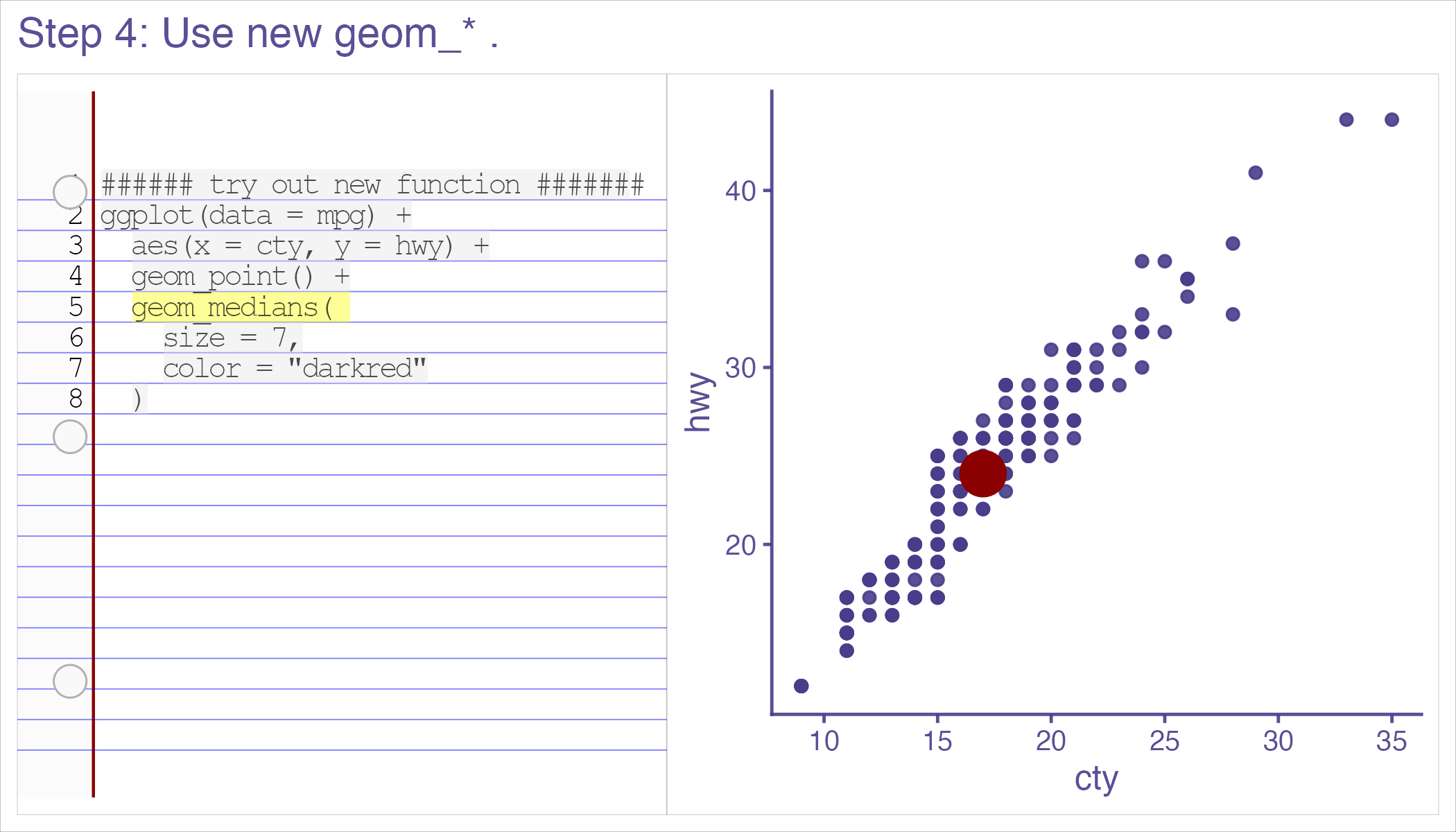 --- class: inverse, center, middle # 'Thanks for sharing these recipes! I've never written my own 'geoms' because I had no idea where to start, but with this resource I'll be putting this to use in my own work soon.' --- class: inverse, center, middle # 'Thank you for putting this into the world' Thomas Lin Pederson --- # 'Easy geom_*() recipes' ## Tested by newcomers. -- ## Approved/Vetted by experts. -- ## Feedback refined. (survey + focus groups) -- ## Kept up-to-date. (ggplot2 4.0.0 release-aware - and now 4 examples, 4 exercises, 4 objectives...) --- class: inverse, middle, center # *'It was that easy. And I felt empowered as a result of that…. But you know, like, my problem isn’t gonna be that easy.'* --- ## Realistic! These *are* 'easy' recipes. -- ## But we have a support group for when thing are hard (ggplot2 extenders)… (and more educational resources in the works) -- # We'd be glad to see you at the extenders meetup or in our discussions!! --- class: center, middle # Thank you! # website: bit.ly/ggplot2extenders # join form: bit.ly/ggplot2extenderscontact # easy recipes: bit.ly/easy-geom-recipes --- <!-- ## --> <!-- # --> <!-- # Outline --> <!-- ## Why data visualization? (preattentive processing - effortless, efficient data communication) --> <!-- -- --> <!-- ## Why ggplot2? (effortless plot specification, like 'spontaneous language in conversation' - like should 'grammar of graphics' be 'language of graphics') --> <!-- -- --> <!-- ## Why extension? (allows for fluency to continue in domains 'base' ggplot2 doesn't support) --> <!-- -- --> <!-- ## How to support extenders (newcomers to extension)? --> <!-- - New educational material --> <!-- - & community --> <!-- <!-- ## And how the recipes came to be... --> <!-- <!-- -- --> <!-- <!-- ## What the ggplot2 4.0.0 release means for the recipes --> --\> <!-- -- --> <!-- ```{r setup, include=FALSE} --> <!-- knitr::opts_chunk$set(echo = TRUE, cache = F, warning = F, message = F) --> <!-- options(tidyverse.quiet = TRUE) --> <!-- library(flipbookr) --> <!-- library(tidyverse) --> <!-- isi_donor_url <- "https://www.isi-stats.com/isi/data/prelim/OrganDonor.txt" --> <!-- donor <- read_delim(isi_donor_url) %>% --> <!-- select(Default, Choice) %>% --> <!-- mutate(decision = ifelse(Choice == "donor", "donor (1)", "not (0)")) %>% --> <!-- mutate(decision = fct_rev(decision)) --> <!-- ``` --> <!-- ------------------------------------------------------------------------ --> <!-- ### --> <!-- Effortless consumption of information - --> <!-- 'preattentive processing' --> <!-- 1/5 of second to identify shapes, patterns, anomolies, regions of high density etc. --> <!-- -- --> <!-- With no 'hit' to cognitive resources. --> <!-- ------------------------------------------------------------------------ --> <!-- > ### "When I need to make sense of some data ... [ggplot2] continues to be just the best thing ever." -- Dewey Dunningham --> <!-- -- --> <!-- # Me: Same! ('You had me at hello'...) --> <!-- --- --> <!-- class: middle, inverse, center --> <!-- # It lets you *'speak your plot into existence'*. (Thomas Lin Pederson) (so your data can easily speak back to you! i.e. reveal patterns) --> <!-- --- --> <!-- ```{r, include = F} --> <!-- knitr::opts_chunk$set(echo = F, comment = "", message = F, --> <!-- warning = F, cache = T, fig.retina = 3) --> <!-- library(tidyverse) --> <!-- library(flipbookr) --> <!-- library(xaringanthemer) --> <!-- xaringanthemer::mono_light( --> <!-- base_color = "#02075D", --> <!-- # header_font_google = google_font("Josefin Sans"), --> <!-- # text_font_google = google_font("Montserrat", "200", "200i"), --> <!-- # code_font_google = google_font("Droid Mono"), --> <!-- text_font_size = ".85cm", --> <!-- code_font_size = ".15cm") --> <!-- theme_set(theme_gray(base_size = 20)) --> <!-- ``` --> <!-- --- --> <!-- class: inverse, center, middle --> <!-- > # "the Grammar of Graphics makes [building plots] easy because you've just got all these, like, little nice decomposable components" -- Hadley Wickham --> <!-- --- --> <!-- Hadley Wickham, on it's motivation: --> <!-- > ### And, you know, I'd get a dataset. And, *in my head I could very clearly kind of picture*, I want to put this on the x-axis. Let's put this on the y-axis, draw a line, put some points here, break it up by this variable. --> <!-- -- --> <!-- > ### And then, like, getting that vision out of my head, and into reality, it's just really, really hard. Just, like, felt harder than it should be. Like, there's a lot of custom programming involved, --> <!-- ------------------------------------------------------------------------ --> <!-- > ### where I just felt, like, to me, I just wanted to say, like, you know, *this is what I'm thinking, this is how I'm picturing this plot. Like you're the computer 'Go and do it'.* --> <!-- | | --> <!-- |----| --> <!-- | \> \### ... and I'd also been reading about the Grammar of Graphics by Leland Wilkinson, I got to meet him a couple of times and ... I was, like, this book has been, like, written for me. <https://www.trifacta.com/podcast/tidy-data-with-hadley-wickham/> | --> <!-- ```{r, include = F} --> <!-- library(tidyverse) --> <!-- library(gapminder) --> <!-- gapminder %>% # data from package --> <!-- filter(year == 2002) -> --> <!-- gapminder_2002 --> <!-- ``` --> <!-- ------------------------------------------------------------------------ --> <!-- r chunk_reveal("scatter", title = "## ggplot2 nails it...", widths = c(2,3))` --> <!-- ```{r scatter, include = F} --> <!-- ggplot(data = gapminder_2002) + --> <!-- aes(x = gdpPercap) + --> <!-- aes(y = lifeExp) + --> <!-- geom_point() + --> <!-- geom_smooth() + --> <!-- facet_wrap(vars(continent)) --> <!-- ``` --> <!-- <!-- --- --> --\> <!-- <!-- class: inverse, center, middle --> --\> <!-- <!-- > # "I'd never know quite how to get things done with matplotlib. But with ggplot2 I could understand it without even looking at documentation (paraphrase) - Hassan Kibirige (plotnine: 'grammar of graphics for python' author) --> --\> <!-- <!-- --- --> --\> <!-- <!-- # Hans Rosling & BBC in 2010 --> --\> <!-- <!-- <iframe width="767" height="431" src="https://www.youtube.com/embed/jbkSRLYSojo?list=PL6F8D7054D12E7C5A" frameborder="0" allow="accelerometer; autoplay; encrypted-media; gyroscope; picture-in-picture" allowfullscreen></iframe> --> --\> <!-- <!-- https://www.youtube.com/embed/jbkSRLYSojo?list=PL6F8D7054D12E7C5A --> --\> <!-- <!-- --- --> --\> <!-- <!-- ## ... I know having the data is not enough. I have to show it in ways people both enjoy and understand --> --\> <!-- <!-- ```{r, out.width="65%", fig.align='center'} --> --\> <!-- <!-- knitr::include_graphics("images/hans_argument.png") --> --\> <!-- <!-- ``` --> --\> <!-- <!-- --- --> --\> <!-- <!-- # 'Here we go. Life expectancy on the y-axis' --> --\> <!-- <!-- ```{r, out.width="80%"} --> --\> <!-- <!-- knitr::include_graphics("images/hans_y_axis.png") --> --\> <!-- <!-- ``` --> --\> <!-- <!-- --- --> --\> <!-- <!-- # 'On the x-axis, wealth' --> --\> <!-- <!-- ```{r, out.width="80%"} --> --\> <!-- <!-- knitr::include_graphics("images/hans_x_axis.png") --> --\> <!-- <!-- ``` --> --\> <!-- <!-- --- --> --\> <!-- <!-- # 'Colors represent the different continents' --> --\> <!-- <!-- ```{r, out.width="80%"} --> --\> <!-- <!-- knitr::include_graphics("images/hans_colors.png") --> --\> <!-- <!-- ``` --> --\> <!-- <!-- --- --> --\> <!-- <!-- # 'Size represents population' --> --\> <!-- <!-- ```{r, out.width="80%"} --> --\> <!-- <!-- knitr::include_graphics("images/hans_size.png") --> --\> <!-- <!-- ``` --> --\> <!-- <!-- --- --> --\> <!-- <!-- class: inverse, center, middle --> --\> <!-- <!-- # Response to speaking plot into existence? --> --\> <!-- <!-- -- --> --\> <!-- <!-- # 10 million views... --> --\> <!-- <!-- -- --> --\> <!-- <!-- (also does animation at the end... which I don't show) --> --\> <!-- <!-- --- --> --\> <!-- ```{r, out.width="45%"} --> <!-- knitr::include_graphics("../../ggram/transcriber_of_imagined_plots.png") --> <!-- ``` --> <!-- ------------------------------------------------------------------------ --> <!-- ## But, sometimes we don't have the vocabulary that's needed to keep 'speaking' fluently. --> <!-- ------------------------------------------------------------------------ --> <!-- ## Example: What's the graphical poem here? --> <!-- ```{r, echo = F} --> <!-- library(ggplot2) --> <!-- ggplot(airquality) + --> <!-- aes(x = Ozone) + --> <!-- geom_rug() + --> <!-- geom_histogram() + --> <!-- ggxmean::geom_x_mean() --> <!-- ``` --> <!-- ??? Consider for example, a the seemingly simple enterprise of adding a vertical line at the mean of x, perhaps atop a histogram or density plot. --> <!-- ------------------------------------------------------------------------ --> <!-- r chunk_reveal("basic", title = "### What's the *base* ggplot2 experience")` --> <!-- ```{r basic} --> <!-- airquality %>% --> <!-- ggplot(data = .) + --> <!-- aes(x = Ozone) + --> <!-- geom_rug() + --> <!-- geom_histogram() + --> <!-- geom_vline( --> <!-- xintercept = --> <!-- mean(airquality$Ozone, --> <!-- na.rm = T) --> <!-- ) -> --> <!-- g --> <!-- ``` --> <!-- ??? Creating this plot requires greater focus on ggplot2 *syntax*, likely detracting from discussion of *the mean* that statistical instructors desire. It may require a discussion about dollar sign syntax and how geom_vline is actually a special geom -- an annotation -- rather than being mapped to the data. None of this is relevant to the point you as an instructor aim to make: maybe that the the mean is the balancing point of the data or maybe a comment about skewness. --> <!-- ------------------------------------------------------------------------ --> <!-- ### Adding the conditional means? --> <!-- ```{r cond_means_hard, echo = F} --> <!-- airquality %>% --> <!-- group_by(Month) %>% --> <!-- summarise( --> <!-- Ozone_mean = --> <!-- mean(Ozone, na.rm = T) --> <!-- ) -> --> <!-- airquality_by_month --> <!-- ggplot(airquality) + --> <!-- aes(x = Ozone) + --> <!-- geom_histogram() + --> <!-- facet_grid(rows = vars(Month)) + --> <!-- geom_vline(data = airquality_by_month, --> <!-- aes(xintercept = --> <!-- Ozone_mean)) --> <!-- ``` --> <!-- ??? --> <!-- Further, for the case of adding a vertical line at the mean for different subsets of the data, a different approach is required. This enterprise may take instructor/analyst/student on an even larger detour -- possibly googling, and maybe landing on the following stack overflow page where 11,000 analytics souls (some repeats to be sure) have landed: --> <!-- ------------------------------------------------------------------------ --> <!-- r chunk_reveal("cond_means_hard", title = "#### Conditional means (may require a trip to stackoverflow!)")` --> <!-- ------------------------------------------------------------------------ --> <!-- # Why is something like geom_smooth() is so easy, and my mean of x line is so hard? --> <!-- ------------------------------------------------------------------------ --> <!-- ## ggbump --> <!-- ```{r, echo = F} --> <!-- library(tidyverse) --> <!-- theme_set(theme_gray(base_size = 18)) --> <!-- us_and_peers <- c("United States", "Germany", --> <!-- "United Kingdom", "France", --> <!-- "Canada") --> <!-- gapminder::gapminder %>% --> <!-- filter(country %in% us_and_peers) %>% --> <!-- mutate(life_exp_rank = rank(-lifeExp), --> <!-- .by = year) -> --> <!-- us_cohort_life_exp_rank_2020 --> <!-- ``` --> <!-- ------------------------------------------------------------------------ --> <!-- r chunk_reveal("bump")` --> <!-- ```{r bump, include = F} --> <!-- library(tidyverse) --> <!-- library(ggbump) --> <!-- us_cohort_life_exp_rank_2020 %>% --> <!-- ggplot() + --> <!-- aes(x = year) + --> <!-- aes(y = life_exp_rank) + --> <!-- geom_point() + --> <!-- aes(color = country) + --> <!-- geom_bump() #<< --> <!-- ``` --> <!-- ------------------------------------------------------------------------ --> <!-- # Snappy Graphical Poem!!! --> <!-- -- --> <!-- # Some nice plot Ar.ti.cu.la.tion! --> <!-- -- --> <!-- # Grateful when plot composition is *staccato*. --> <!-- ```{r, eval = F} --> <!-- life_exp_rank_2020 %>% --> <!-- ggplot() + --> <!-- aes(x = year, --> <!-- y = life_exp_rank, --> <!-- color = country) + --> <!-- geom_point() + --> <!-- geom_bump() #<< --> <!-- ``` --> <!-- ------------------------------------------------------------------------ --> <!-- ## Saw Thomas Lin Pederson's talk 'Extending your ability to extend ggplot2' January 2020 geom_circle() - (live at RStudio::Conf) --> <!-- -- --> <!-- #### and tried --> <!-- -- --> <!-- #### and failed --> <!-- -- --> <!-- #### and tried --> <!-- -- --> <!-- #### and failed --> <!-- -- --> <!-- #### and kind of figured things out in December 2020.... --> <!-- -- --> <!-- And it was everything I'd hoped for! --> <!-- ------------------------------------------------------------------------ --> <!-- My experience, might be pretty typical... 2x I've heard folks say 'extension is not for the faint of heart'. --> <!-- ------------------------------------------------------------------------ --> <!-- # Wanted to fit in more extension to my life --> <!-- -- --> <!-- ## Fall 2021 Independent studies... <https://github.com/EvaMaeRey/ay_2022_2_advanced_individual_study-> --> <!-- ### - `geom_high_leverage` Morgan --> <!-- ### - `geom_high_influence` Madison --> <!-- ------------------------------------------------------------------------ --> <!-- ## Spring 2022 independent study: make a tutorial. --> <!-- ### w/ Morgan: 'a no-struggle introduction to layer extension, for unsophisticated ggplot2 users' --> <!-- ------------------------------------------------------------------------ --> <!-- ## 3 examples, 3 exercises, 3 objectives: --> <!-- -- --> <!-- ## - 1. Learn how to prepare compute for group-wise computation in a layer --> <!-- -- --> <!-- ## - 2. Learn how to define a Stat (and test) --> <!-- -- --> <!-- ## - 3. Learn how to combine a Stat and Geom into a user-facing function --> <!-- ------------------------------------------------------------------------ --> <!-- ## How to make it easy? --> <!-- ## - easy, familiar (boring) compute --> <!-- -- --> <!-- ## - step-by-step --> <!-- -- --> <!-- ## - pre step (Step 0) - connect it to what you know (get the job done with base ggplot2) --> <!-- ------------------------------------------------------------------------ --> <!-- # Stat-based geom\_\*() functions is focus. Why? --> <!-- ## - Stats are easy\* --> <!-- -- --> <!-- ## - `geoms_\*()`s are familiar --> <!-- -- --> <!-- - relatively easy compared to Geoms and position... --> <!-- ------------------------------------------------------------------------ --> <!-- # Stat-based geom\_\*() functions is focus. Why? --> <!-- #### \> I've used ggplot for a very long time... Conceptually I get `$$the difference between `stat_*()` functions and `geom_()*`s functions.$$` But... I would not put `+ stat_*()` anything. That's not something I would naturally do after using the gg platform... for 10 years. --> <!-- ------------------------------------------------------------------------ --> <!-- ## In 2023, survey, focus group about bare-bones, download a .Rmd --> <!-- -- --> <!-- ## 2024 Moved to webr/quarto, added explanation (I didn't really have much vocabulary in 2023!) --> <!-- -- --> <!-- ## May 2025 survey + focus group... --> <!-- ------------------------------------------------------------------------ --> <!-- ## Participant profile --> <!-- ```{r, echo = F, fig.show='hold', out.width="25%"} --> <!-- files <- fs::dir_ls("../../posit-consulting/report_figures/") --> <!-- knitr::include_graphics(path = files[1]) --> <!-- knitr::include_graphics(path = files[2]) --> <!-- knitr::include_graphics(path = files[3]) --> <!-- knitr::include_graphics(path = files[4]) --> <!-- knitr::include_graphics(path = files[5]) --> <!-- knitr::include_graphics(path = files[6]) --> <!-- knitr::include_graphics(path = files[7]) --> <!-- knitr::include_graphics(path = files[8]) --> <!-- ``` --> <!-- ------------------------------------------------------------------------ --> <!-- ```{r} --> <!-- knitr::include_graphics("../../posit-consulting/step0.png") --> <!-- ``` --> <!-- ------------------------------------------------------------------------ --> <!-- ```{r} --> <!-- knitr::include_graphics("../../posit-consulting/step1.png") --> <!-- ``` --> <!-- ------------------------------------------------------------------------ --> <!-- ```{r} --> <!-- knitr::include_graphics("../../posit-consulting/step3.png") --> <!-- ``` --> <!-- ------------------------------------------------------------------------ --> <!-- ```{r} --> <!-- knitr::include_graphics("../../posit-consulting/done.png") --> <!-- ``` --> <!-- ------------------------------------------------------------------------ --> <!-- ## Participant feedback --> <!-- ```{r, echo = F, fig.show='hold'} --> <!-- files <- fs::dir_ls("../../posit-consulting/report_figures/") --> <!-- knitr::include_graphics(path = files[11]) --> <!-- knitr::include_graphics(path = files[12]) --> <!-- knitr::include_graphics(path = files[13]) --> <!-- knitr::include_graphics(path = files[14]) --> <!-- knitr::include_graphics(path = files[15]) --> <!-- knitr::include_graphics(path = files[16]) --> <!-- knitr::include_graphics(path = files[17]) --> <!-- knitr::include_graphics(path = files[18]) --> <!-- ``` --> <!-- ------------------------------------------------------------------------ --> <!-- # 'You are here 𐄂' --> <!-- -- --> <!-- ## Now 'easy geom recipes' X July 2025 release --> <!-- -- --> <!-- ggplot2 release party at ggplot2 extenders meetup. --> <!-- ------------------------------------------------------------------------ --> <!-- > # It was that easy. And I felt empowered as a result of that…. But you know, like, my problem isn’t gonna be that easy. --> <!-- ------------------------------------------------------------------------ --> <!-- Support group... --> <!-- ------------------------------------------------------------------------ --> <!-- ------------------------------------------------------------------------ --> <!-- # In next ggplot2 release --> <!-- ```{r, echo = F} --> <!-- library(ggplot2) --> <!-- StatMedians <- ggproto("StatMedians", Stat) --> <!-- ``` --> <!-- ------------------------------------------------------------------------ --> <!-- > #### 'take care to match the argument order and naming used in the ggplot2’s constructors so you don’t surprise your users.' --> <!-- -- --> <!-- #### Writing user-facing function will get so easy! (and maybe a little more mysterious...) --> <!-- ```{r, eval = T, echo = T} --> <!-- stat_medians <- make_constructor(StatMedians, geom = "point") --> <!-- geom_medians <- make_constructor(GeomPoint, stat = "medians") --> <!-- geom_medians --> <!-- ``` --> <!-- ------------------------------------------------------------------------ --> <!-- ### Also, --> <!-- -- --> <!-- ### 'I've opened a PR for adding a 'manual' stat, where essentially the compute_group() method is available to the user. --> <!-- ### Probably a lot of your recipes work there as well, without having to actually build a Stat :)' - Teun in extenders discussions Sept 2024 --> <!-- <https://github.com/tidyverse/ggplot2/pull/6143> --> <!-- ------------------------------------------------------------------------ --> <!-- ### ggplot2 4.0.0 Epilogue: our vline at mean of x motivating example w/ ggplot2 4.0.0 stat_manual... Not bad! --> <!-- ```{r, echo = T, fig.show="hold", out.width="25%"} --> <!-- library(ggplot2) --> <!-- ggplot(airquality) + --> <!-- aes(x = Ozone) + --> <!-- geom_histogram() + --> <!-- stat_manual(geom = GeomVline, --> <!-- fun = ~ summarize(.x, xintercept = mean(x, na.rm = T))) --> <!-- last_plot() + --> <!-- facet_grid(rows = vars(Month)) --> <!-- ``` --> <!-- ------------------------------------------------------------------------ --> <!-- ## Willing to type a tad more: `geom_xmean` 'easy recipes approach' X ggplot2 4.0.0's make_constructor()? --> <!-- ```{r, fig.show="hold"} --> <!-- compute_means <- function(data, scales){ --> <!-- data |> summarise(xintercept = mean(x, na.rm = T)) --> <!-- } --> <!-- StatXmean <- ggproto("StatXmean", --> <!-- Stat, --> <!-- compute_group = compute_means, --> <!-- required_aes = "x") --> <!-- geom_xmean <- make_constructor(GeomVline, stat = StatXmean) --> <!-- ``` --> <!-- ------------------------------------------------------------------------ --> <!-- # --\> the ggplot2 experience! --> <!-- ```{r, out.width="25%", echo= T, fig.show='hold'} --> <!-- ggplot(airquality) + --> <!-- aes(x = Ozone) + --> <!-- geom_histogram() + --> <!-- geom_xmean() #<< --> <!-- last_plot() + --> <!-- facet_grid(rows = vars(Month)) --> <!-- ``` --> <!-- ------------------------------------------------------------------------ --> <!-- ## But, stat_manual made me feel I should cover more territory (lest you ask why do I need the recipes, I can get everything done w/ stat_manual) --> <!-- -- --> <!-- So now there are 4 recipes, where compute_panel is introduced (not just compute_group) in recipe 2 and used in 3 and 4. --> <!-- ------------------------------------------------------------------------ --> <!-- New questions... --> <!-- ## Are `compute_panel` recipes they still accessible, interesting enough, correct? --> <!-- -- --> <!-- ## Do you still feel motivated by `compute_group` Stat example given stat_manual? --> <!-- ------------------------------------------------------------------------ --> <!-- > Wait, why did we do a Stat and not a Geom like, like ... the tutorial starts with, you're gonna make a geom\_*() but I made a stat\_*(). --> <!-- ------------------------------------------------------------------------ --> <!-- > **Participant H** I just think that it's weird to have two things that live at the `$$same level$$`, because ultimately they all filter down to layer. And it's really a layer that you're creating. --> <!-- ------------------------------------------------------------------------ --> <!-- > **Participant D** There's a sense in which also, like, you feel that maybe everything should just be 'layer\_'. But the problem is that nobody actually does that in practice. And so, you know, you would be teaching something, and it would be kind of a ggplot variant that nobody else really uses. --> <!-- ------------------------------------------------------------------------ --> <!-- > 'Stat objects are almost always paired with a geom\_\*() constructor because most ggplot2 users are accustomed to adding geom\_\*()s, not stat\_\*()s, when building up a plot.' - ggplot2 book, Extension springs case study --> <!-- ```{r} --> <!-- knitr::include_graphics("../../posit-consulting/report_figures/unnamed-chunk-35-1.svg") --> <!-- ``` --> <!-- ------------------------------------------------------------------------ --> <!-- ```{r} --> <!-- knitr::include_graphics("../../posit-consulting/report_figures/unnamed-chunk-35-2.svg") --> <!-- ``` --> <!-- ------------------------------------------------------------------------ --> <!-- ```{r} --> <!-- knitr::include_graphics("../../posit-consulting/report_figures/unnamed-chunk-35-3.svg") --> <!-- ``` -->