class: inverse, bottom background-image: url(https://images.unsplash.com/photo-1559827260-dc66d52bef19?ixlib=rb-4.0.3&ixid=M3wxMjA3fDB8MHxwaG90by1wYWdlfHx8fGVufDB8fHx8fA%3D%3D&auto=format&fit=crop&w=1470&q=80) background-size: cover # .Large[Who are the ggplot2 extenders] ## .large[And how to become one...] #### .small[Evangeline 'Gina' Reynolds \| 2025-08-26 \| Posit Conf, Image credit: Silas Baisch, Upsplash] --- # Part 1. Who are the ggplot2 extenders? -- # I'm here to advertise a ggplot2 extension meetup/club/working group… --- # Also known as 'the ggplot2 extenders'  --- <!-- # So instead of answering Part I. 'who are the ggplot2 extenders?’ --> <!-- -- --> <!-- # as 'who has extended ggplot2’, --> <!-- 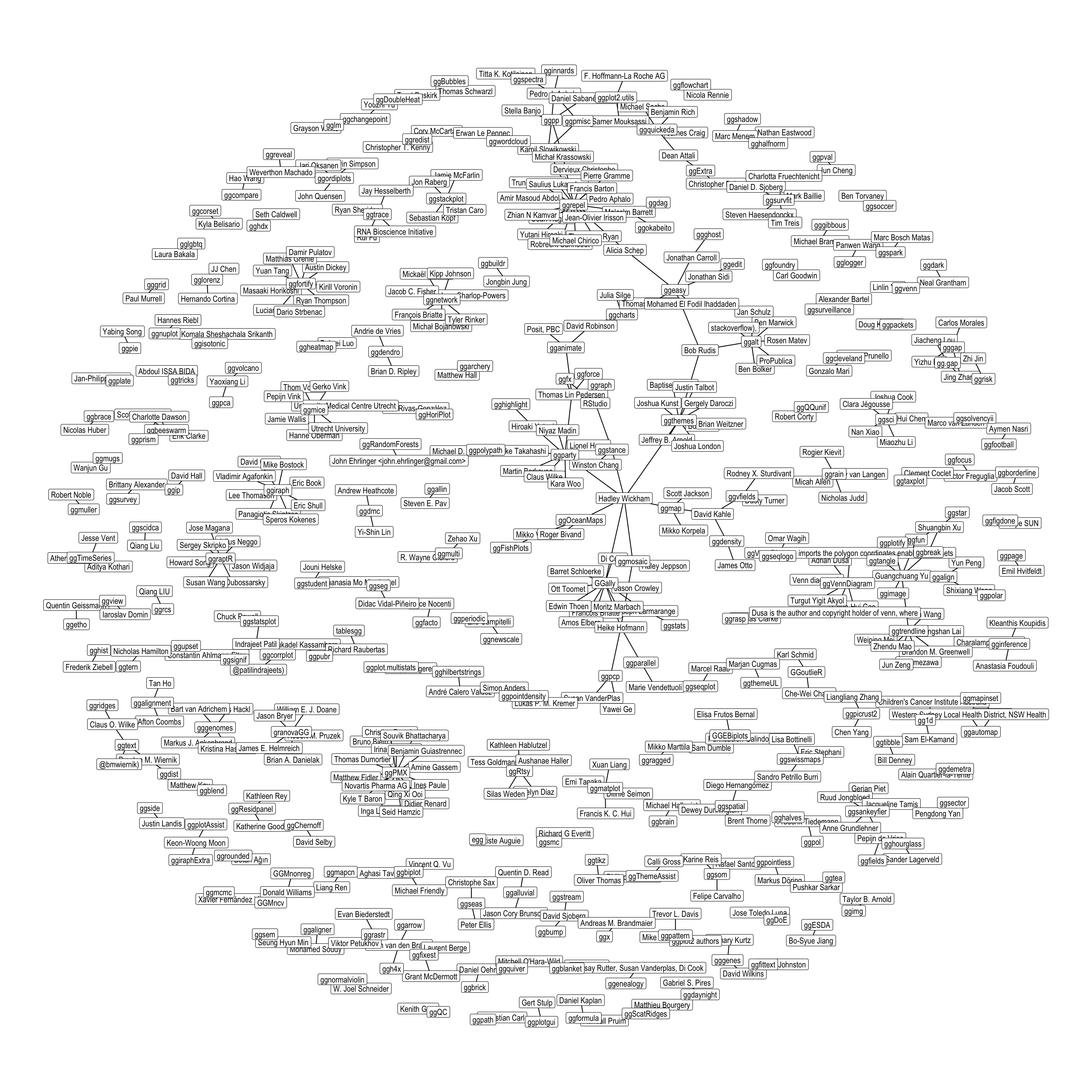 --> --- # Part 0. Why ggplot2 and why extension? -- # Part 2. How to become an extender? (pathways...) -- # Part 1. Who are 'the ggplot2 extenders'? --- class: inverse # Part 00. Why ggplot2? -- # Because of the way it sounds... --- ## ggplot2 'poems' --- ## ggplot2 ~~'poems'~~ --- ## ggplot2 'songs' -- are bubbly. -- effervescent. -- easy. -- articulated. -- springy. -- staccato. --- class: inverse, bottom background-image: url(images/frueling_ubers_jahr_articulation.png) background-size: contain --- [00:00-00:04 intro](https://youtu.be/ytqXCO3-lOs?si=rF8znHifImsacwXo&t=1) --- class: inverse, bottom background-image: url(https://images.unsplash.com/photo-1517093911940-08cb5b3952e7?q=80&w=444&auto=format&fit=crop&ixlib=rb-4.1.0&ixid=M3wxMjA3fDB8MHxwaG90by1wYWdlfHx8fGVufDB8fHx8fA%3D%3D) background-size: cover --- <!-- --- --> <!-- class: inverse --> <!-- # On motivation: --> <!-- > ### And, you know, I'd get a dataset. And, *in my head I could very clearly kind of picture*, I want to put this on the x-axis. Let's put this on the y-axis, draw a line, put some points here, break it up by this variable. --> <!-- -- --> <!-- > ### And then, like, getting that vision out of my head, and into reality, it's just really, really hard. Just, like, felt harder than it should be. Like, there's a lot of custom programming involved, --> <!-- --- --> <!-- class: inverse --> <!-- > ### where I just felt, like, to me, I just wanted to say, like, you know, *this is what I'm thinking, this is how I'm picturing this plot. Like you're the computer 'Go and do it'.* --> <!-- -- --> <!-- > ### ... and I'd also been reading about the Grammar of Graphics by Leland Wilkinson, I got to meet him a couple of times and ... I was, like, this book has been, like, written for me. <https://www.trifacta.com/podcast/tidy-data-with-hadley-wickham/> --> --- count: false ## effervecent ggplot2... .panel1-scatter-auto[ ``` r *gapminder_2002 ``` ] .panel2-scatter-auto[ ``` ## # A tibble: 142 × 6 ## country continent year lifeExp pop gdpPercap ## <fct> <fct> <int> <dbl> <int> <dbl> ## 1 Afghanistan Asia 2002 42.1 25268405 727. ## 2 Albania Europe 2002 75.7 3508512 4604. ## 3 Algeria Africa 2002 71.0 31287142 5288. ## 4 Angola Africa 2002 41.0 10866106 2773. ## 5 Argentina Americas 2002 74.3 38331121 8798. ## 6 Australia Oceania 2002 80.4 19546792 30688. ## 7 Austria Europe 2002 79.0 8148312 32418. ## 8 Bahrain Asia 2002 74.8 656397 23404. ## 9 Bangladesh Asia 2002 62.0 135656790 1136. ## 10 Belgium Europe 2002 78.3 10311970 30486. ## # ℹ 132 more rows ``` ] --- count: false ## effervecent ggplot2... .panel1-scatter-auto[ ``` r gapminder_2002 |> * ggplot() ``` ] .panel2-scatter-auto[ <!-- --> ] --- count: false ## effervecent ggplot2... .panel1-scatter-auto[ ``` r gapminder_2002 |> ggplot() + * aes(x = gdpPercap) ``` ] .panel2-scatter-auto[ <!-- --> ] --- count: false ## effervecent ggplot2... .panel1-scatter-auto[ ``` r gapminder_2002 |> ggplot() + aes(x = gdpPercap) + * aes(y = lifeExp) ``` ] .panel2-scatter-auto[ <!-- --> ] --- count: false ## effervecent ggplot2... .panel1-scatter-auto[ ``` r gapminder_2002 |> ggplot() + aes(x = gdpPercap) + aes(y = lifeExp) + * geom_point() ``` ] .panel2-scatter-auto[ <!-- --> ] --- count: false ## effervecent ggplot2... .panel1-scatter-auto[ ``` r gapminder_2002 |> ggplot() + aes(x = gdpPercap) + aes(y = lifeExp) + geom_point() + * geom_smooth() ``` ] .panel2-scatter-auto[ <!-- --> ] --- count: false ## effervecent ggplot2... .panel1-scatter-auto[ ``` r gapminder_2002 |> ggplot() + aes(x = gdpPercap) + aes(y = lifeExp) + geom_point() + geom_smooth() + * facet_wrap(vars(continent)) ``` ] .panel2-scatter-auto[ <!-- --> ] <style> .panel1-scatter-auto { color: black; width: 39.2%; hight: 32%; float: left; padding-left: 1%; font-size: 80% } .panel2-scatter-auto { color: black; width: 58.8%; hight: 32%; float: left; padding-left: 1%; font-size: 80% } .panel3-scatter-auto { color: black; width: NA%; hight: 33%; float: left; padding-left: 1%; font-size: 80% } </style> --- class: inverse, center, middle # staccato. -- graphical. -- poems. --- # Hadley: > ## the Grammar of Graphics [is] easy because you've just got all these... -- > ## nice -- > ## little -- > ## decomposable -- > ## components. ---  <!-- # deeply satisfying. --> -- <!-- # but sometimes it's not like that. -->  --- # What's the graphical poem here? 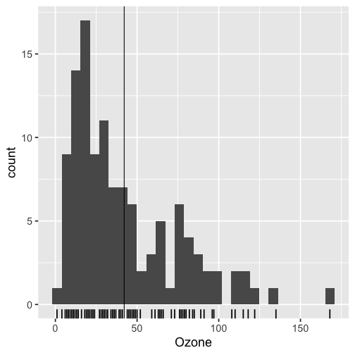<!-- --> ??? Consider for example, a the seemingly simple enterprise of adding a vertical line at the mean of x, perhaps atop a histogram or density plot. --- count: false ### What's the *base* ggplot2 experience .panel1-basic-auto[ ``` r *airquality ``` ] .panel2-basic-auto[ ``` ## Ozone Solar.R Wind Temp Month Day ## 1 41 190 7.4 67 5 1 ## 2 36 118 8.0 72 5 2 ## 3 12 149 12.6 74 5 3 ## 4 18 313 11.5 62 5 4 ## 5 NA NA 14.3 56 5 5 ## 6 28 NA 14.9 66 5 6 ## 7 23 299 8.6 65 5 7 ## 8 19 99 13.8 59 5 8 ## 9 8 19 20.1 61 5 9 ## 10 NA 194 8.6 69 5 10 ## 11 7 NA 6.9 74 5 11 ## 12 16 256 9.7 69 5 12 ## 13 11 290 9.2 66 5 13 ## 14 14 274 10.9 68 5 14 ## 15 18 65 13.2 58 5 15 ## 16 14 334 11.5 64 5 16 ## 17 34 307 12.0 66 5 17 ## 18 6 78 18.4 57 5 18 ## 19 30 322 11.5 68 5 19 ## 20 11 44 9.7 62 5 20 ## 21 1 8 9.7 59 5 21 ## 22 11 320 16.6 73 5 22 ## 23 4 25 9.7 61 5 23 ## 24 32 92 12.0 61 5 24 ## 25 NA 66 16.6 57 5 25 ## 26 NA 266 14.9 58 5 26 ## 27 NA NA 8.0 57 5 27 ## 28 23 13 12.0 67 5 28 ## 29 45 252 14.9 81 5 29 ## 30 115 223 5.7 79 5 30 ## 31 37 279 7.4 76 5 31 ## 32 NA 286 8.6 78 6 1 ## 33 NA 287 9.7 74 6 2 ## 34 NA 242 16.1 67 6 3 ## 35 NA 186 9.2 84 6 4 ## 36 NA 220 8.6 85 6 5 ## 37 NA 264 14.3 79 6 6 ## 38 29 127 9.7 82 6 7 ## 39 NA 273 6.9 87 6 8 ## 40 71 291 13.8 90 6 9 ## 41 39 323 11.5 87 6 10 ## 42 NA 259 10.9 93 6 11 ## 43 NA 250 9.2 92 6 12 ## 44 23 148 8.0 82 6 13 ## 45 NA 332 13.8 80 6 14 ## 46 NA 322 11.5 79 6 15 ## 47 21 191 14.9 77 6 16 ## 48 37 284 20.7 72 6 17 ## 49 20 37 9.2 65 6 18 ## 50 12 120 11.5 73 6 19 ## 51 13 137 10.3 76 6 20 ## 52 NA 150 6.3 77 6 21 ## 53 NA 59 1.7 76 6 22 ## 54 NA 91 4.6 76 6 23 ## 55 NA 250 6.3 76 6 24 ## 56 NA 135 8.0 75 6 25 ## 57 NA 127 8.0 78 6 26 ## 58 NA 47 10.3 73 6 27 ## 59 NA 98 11.5 80 6 28 ## 60 NA 31 14.9 77 6 29 ## 61 NA 138 8.0 83 6 30 ## 62 135 269 4.1 84 7 1 ## 63 49 248 9.2 85 7 2 ## 64 32 236 9.2 81 7 3 ## 65 NA 101 10.9 84 7 4 ## 66 64 175 4.6 83 7 5 ## 67 40 314 10.9 83 7 6 ## 68 77 276 5.1 88 7 7 ## 69 97 267 6.3 92 7 8 ## 70 97 272 5.7 92 7 9 ## 71 85 175 7.4 89 7 10 ## 72 NA 139 8.6 82 7 11 ## 73 10 264 14.3 73 7 12 ## 74 27 175 14.9 81 7 13 ## 75 NA 291 14.9 91 7 14 ## 76 7 48 14.3 80 7 15 ## 77 48 260 6.9 81 7 16 ## 78 35 274 10.3 82 7 17 ## 79 61 285 6.3 84 7 18 ## 80 79 187 5.1 87 7 19 ## 81 63 220 11.5 85 7 20 ## 82 16 7 6.9 74 7 21 ## 83 NA 258 9.7 81 7 22 ## 84 NA 295 11.5 82 7 23 ## 85 80 294 8.6 86 7 24 ## 86 108 223 8.0 85 7 25 ## 87 20 81 8.6 82 7 26 ## 88 52 82 12.0 86 7 27 ## 89 82 213 7.4 88 7 28 ## 90 50 275 7.4 86 7 29 ## 91 64 253 7.4 83 7 30 ## 92 59 254 9.2 81 7 31 ## 93 39 83 6.9 81 8 1 ## 94 9 24 13.8 81 8 2 ## 95 16 77 7.4 82 8 3 ## 96 78 NA 6.9 86 8 4 ## 97 35 NA 7.4 85 8 5 ## 98 66 NA 4.6 87 8 6 ## 99 122 255 4.0 89 8 7 ## 100 89 229 10.3 90 8 8 ## 101 110 207 8.0 90 8 9 ## 102 NA 222 8.6 92 8 10 ## 103 NA 137 11.5 86 8 11 ## 104 44 192 11.5 86 8 12 ## 105 28 273 11.5 82 8 13 ## 106 65 157 9.7 80 8 14 ## 107 NA 64 11.5 79 8 15 ## 108 22 71 10.3 77 8 16 ## 109 59 51 6.3 79 8 17 ## 110 23 115 7.4 76 8 18 ## 111 31 244 10.9 78 8 19 ## 112 44 190 10.3 78 8 20 ## 113 21 259 15.5 77 8 21 ## 114 9 36 14.3 72 8 22 ## 115 NA 255 12.6 75 8 23 ## 116 45 212 9.7 79 8 24 ## 117 168 238 3.4 81 8 25 ## 118 73 215 8.0 86 8 26 ## 119 NA 153 5.7 88 8 27 ## 120 76 203 9.7 97 8 28 ## 121 118 225 2.3 94 8 29 ## 122 84 237 6.3 96 8 30 ## 123 85 188 6.3 94 8 31 ## 124 96 167 6.9 91 9 1 ## 125 78 197 5.1 92 9 2 ## 126 73 183 2.8 93 9 3 ## 127 91 189 4.6 93 9 4 ## 128 47 95 7.4 87 9 5 ## 129 32 92 15.5 84 9 6 ## 130 20 252 10.9 80 9 7 ## 131 23 220 10.3 78 9 8 ## 132 21 230 10.9 75 9 9 ## 133 24 259 9.7 73 9 10 ## 134 44 236 14.9 81 9 11 ## 135 21 259 15.5 76 9 12 ## 136 28 238 6.3 77 9 13 ## 137 9 24 10.9 71 9 14 ## 138 13 112 11.5 71 9 15 ## 139 46 237 6.9 78 9 16 ## 140 18 224 13.8 67 9 17 ## 141 13 27 10.3 76 9 18 ## 142 24 238 10.3 68 9 19 ## 143 16 201 8.0 82 9 20 ## 144 13 238 12.6 64 9 21 ## 145 23 14 9.2 71 9 22 ## 146 36 139 10.3 81 9 23 ## 147 7 49 10.3 69 9 24 ## 148 14 20 16.6 63 9 25 ## 149 30 193 6.9 70 9 26 ## 150 NA 145 13.2 77 9 27 ## 151 14 191 14.3 75 9 28 ## 152 18 131 8.0 76 9 29 ## 153 20 223 11.5 68 9 30 ``` ] --- count: false ### What's the *base* ggplot2 experience .panel1-basic-auto[ ``` r airquality %>% * ggplot(data = .) ``` ] .panel2-basic-auto[ <!-- --> ] --- count: false ### What's the *base* ggplot2 experience .panel1-basic-auto[ ``` r airquality %>% ggplot(data = .) + * aes(x = Ozone) ``` ] .panel2-basic-auto[ <!-- --> ] --- count: false ### What's the *base* ggplot2 experience .panel1-basic-auto[ ``` r airquality %>% ggplot(data = .) + aes(x = Ozone) + * geom_rug() ``` ] .panel2-basic-auto[ <!-- --> ] --- count: false ### What's the *base* ggplot2 experience .panel1-basic-auto[ ``` r airquality %>% ggplot(data = .) + aes(x = Ozone) + geom_rug() + * geom_histogram() ``` ] .panel2-basic-auto[ 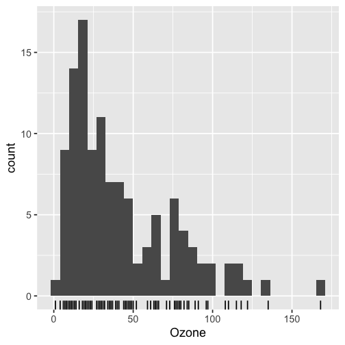<!-- --> ] --- count: false ### What's the *base* ggplot2 experience .panel1-basic-auto[ ``` r airquality %>% ggplot(data = .) + aes(x = Ozone) + geom_rug() + geom_histogram() + * geom_vline( * xintercept = * mean(airquality$Ozone, * na.rm = T) * ) ``` ] .panel2-basic-auto[ 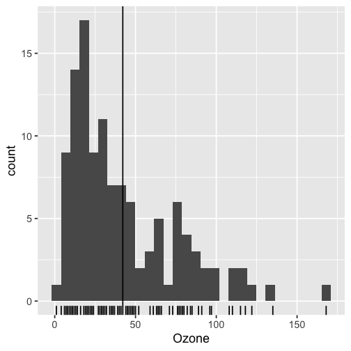<!-- --> ] <style> .panel1-basic-auto { color: black; width: 38.6060606060606%; hight: 32%; float: left; padding-left: 1%; font-size: 80% } .panel2-basic-auto { color: black; width: 59.3939393939394%; hight: 32%; float: left; padding-left: 1%; font-size: 80% } .panel3-basic-auto { color: black; width: NA%; hight: 33%; float: left; padding-left: 1%; font-size: 80% } </style> ??? Creating this plot requires greater focus on ggplot2 *syntax*, likely detracting from discussion of *the mean* that statistical instructors desire. It may require a discussion about dollar sign syntax and how geom_vline is actually a special geom -- an annotation -- rather than being mapped to the data. None of this is relevant to the point you as an instructor aim to make: maybe that the the mean is the balancing point of the data or maybe a comment about skewness. --- class: inverse, bottom background-image: url(https://images.unsplash.com/photo-1742531616501-3fdd94e5a435?q=80&w=858&auto=format&fit=crop&ixlib=rb-4.1.0&ixid=M3wxMjA3fDB8MHxwaG90by1wYWdlfHx8fGVufDB8fHx8fA%3D%3D) background-size: cover <!-- --- --> <!-- > ### 'ggplot2 [is] the best thing ever.' Dewey Dunningham --> <!-- -- --> <!-- > ### The plot-element articulation lets you 'ggplot2 let's you speak your plots into existence.' -- Thomas Lin Pedersen --> <!-- > ### Unfettered conversations with your data. (Visual information is processed 'preattentively' - seeing patterns, ..., is effortless) --> --- ### Adding the conditional means? <!-- --> --- count: false .panel1-cond_means_hard-user[ ``` r # precompute *airquality_by_month <- airquality %>% * group_by(Month) %>% * summarise( * Ozone_mean = * mean(Ozone, na.rm = T) * ) ``` ] .panel2-cond_means_hard-user[ ] --- count: false .panel1-cond_means_hard-user[ ``` r # precompute airquality_by_month <- airquality %>% group_by(Month) %>% summarise( Ozone_mean = mean(Ozone, na.rm = T) ) *ggplot(airquality) ``` ] .panel2-cond_means_hard-user[ <!-- --> ] --- count: false .panel1-cond_means_hard-user[ ``` r # precompute airquality_by_month <- airquality %>% group_by(Month) %>% summarise( Ozone_mean = mean(Ozone, na.rm = T) ) ggplot(airquality) + * aes(x = Ozone) ``` ] .panel2-cond_means_hard-user[ <!-- --> ] --- count: false .panel1-cond_means_hard-user[ ``` r # precompute airquality_by_month <- airquality %>% group_by(Month) %>% summarise( Ozone_mean = mean(Ozone, na.rm = T) ) ggplot(airquality) + aes(x = Ozone) + * geom_histogram() ``` ] .panel2-cond_means_hard-user[ <!-- --> ] --- count: false .panel1-cond_means_hard-user[ ``` r # precompute airquality_by_month <- airquality %>% group_by(Month) %>% summarise( Ozone_mean = mean(Ozone, na.rm = T) ) ggplot(airquality) + aes(x = Ozone) + geom_histogram() + * facet_grid(rows = vars(Month)) ``` ] .panel2-cond_means_hard-user[ 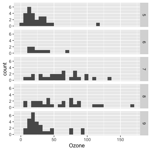<!-- --> ] --- count: false .panel1-cond_means_hard-user[ ``` r # precompute airquality_by_month <- airquality %>% group_by(Month) %>% summarise( Ozone_mean = mean(Ozone, na.rm = T) ) ggplot(airquality) + aes(x = Ozone) + geom_histogram() + facet_grid(rows = vars(Month)) + * geom_vline(data = * airquality_by_month, * aes(xintercept = * Ozone_mean)) ``` ] .panel2-cond_means_hard-user[ 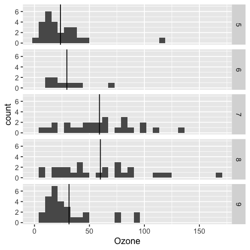<!-- --> ] <style> .panel1-cond_means_hard-user { color: black; width: 38.6060606060606%; hight: 32%; float: left; padding-left: 1%; font-size: 80% } .panel2-cond_means_hard-user { color: black; width: 59.3939393939394%; hight: 32%; float: left; padding-left: 1%; font-size: 80% } .panel3-cond_means_hard-user { color: black; width: NA%; hight: 33%; float: left; padding-left: 1%; font-size: 80% } </style> ??? Further, for the case of adding a vertical line at the mean for different subsets of the data, a different approach is required. This enterprise may take instructor/analyst/student on an even larger detour -- possibly googling, and maybe landing on the following stack overflow page where 11,000 analytics souls (some repeats to be sure) have landed: ---  ---  --- # Part II How to become one...? A. Lots of failure. Alone. B. More guided... --- ## ggbump --- count: false .panel1-bump-auto[ ``` r *library(tidyverse) ``` ] .panel2-bump-auto[ ] --- count: false .panel1-bump-auto[ ``` r library(tidyverse) *library(ggbump) ``` ] .panel2-bump-auto[ ] --- count: false .panel1-bump-auto[ ``` r library(tidyverse) library(ggbump) *us_cohort_life_exp_rank_2020 ``` ] .panel2-bump-auto[ ``` ## # A tibble: 60 × 7 ## country continent year lifeExp pop gdpPercap life_exp_rank ## <fct> <fct> <int> <dbl> <int> <dbl> <dbl> ## 1 Canada Americas 1952 68.8 14785584 11367. 2 ## 2 Canada Americas 1957 70.0 17010154 12490. 2 ## 3 Canada Americas 1962 71.3 18985849 13462. 1 ## 4 Canada Americas 1967 72.1 20819767 16077. 1 ## 5 Canada Americas 1972 72.9 22284500 18971. 1 ## 6 Canada Americas 1977 74.2 23796400 22091. 1 ## 7 Canada Americas 1982 75.8 25201900 22899. 1 ## 8 Canada Americas 1987 76.9 26549700 26627. 1 ## 9 Canada Americas 1992 78.0 28523502 26343. 1 ## 10 Canada Americas 1997 78.6 30305843 28955. 2 ## # ℹ 50 more rows ``` ] --- count: false .panel1-bump-auto[ ``` r library(tidyverse) library(ggbump) us_cohort_life_exp_rank_2020 %>% * ggplot() ``` ] .panel2-bump-auto[ <!-- --> ] --- count: false .panel1-bump-auto[ ``` r library(tidyverse) library(ggbump) us_cohort_life_exp_rank_2020 %>% ggplot() + * aes(x = year) ``` ] .panel2-bump-auto[ <!-- --> ] --- count: false .panel1-bump-auto[ ``` r library(tidyverse) library(ggbump) us_cohort_life_exp_rank_2020 %>% ggplot() + aes(x = year) + * aes(y = life_exp_rank) ``` ] .panel2-bump-auto[ <!-- --> ] --- count: false .panel1-bump-auto[ ``` r library(tidyverse) library(ggbump) us_cohort_life_exp_rank_2020 %>% ggplot() + aes(x = year) + aes(y = life_exp_rank) + * geom_point() ``` ] .panel2-bump-auto[ <!-- --> ] --- count: false .panel1-bump-auto[ ``` r library(tidyverse) library(ggbump) us_cohort_life_exp_rank_2020 %>% ggplot() + aes(x = year) + aes(y = life_exp_rank) + geom_point() + * aes(color = country) ``` ] .panel2-bump-auto[ <!-- --> ] --- count: false .panel1-bump-auto[ ``` r library(tidyverse) library(ggbump) us_cohort_life_exp_rank_2020 %>% ggplot() + aes(x = year) + aes(y = life_exp_rank) + geom_point() + aes(color = country) + * geom_bump() #<< ``` ] .panel2-bump-auto[ <!-- --> ] <style> .panel1-bump-auto { color: black; width: 38.6060606060606%; hight: 32%; float: left; padding-left: 1%; font-size: 80% } .panel2-bump-auto { color: black; width: 59.3939393939394%; hight: 32%; float: left; padding-left: 1%; font-size: 80% } .panel3-bump-auto { color: black; width: NA%; hight: 33%; float: left; padding-left: 1%; font-size: 80% } </style> --- # This plot composition is so *staccato*! ``` r life_exp_rank_2020 %>% ggplot() + aes(x = year, y = life_exp_rank, color = country) + geom_point() + * geom_bump() ``` --- ## Saw Thomas Lin Pederson's talk 'Extending your ability to extend ggplot2' January 2020 geom_circle() - (live at RStudio::Conf) -- #### and tried -- #### and failed -- #### and tried -- #### and failed -- #### and kind of figured things out in December 2020.... -- And it was everything I'd hoped for! --- My experience, might be pretty typical... 2x I've heard folks say 'extension is not for the faint of heart'. --- # - 'I have two kids, it's so hard to be so deep in ggplot, it takes at least two days just to get all the information in your head again. So I'm struggling with maintaining [ggbump, ggaluvial, ggsankey]' -- # Delivering new layer extensions can be costly. --- # - 'I have 200 kids...' Univeristy Professor --- # - 'I have 1000 kids...' Academy Curriculum Director --- # - 'I have a thesis to finish' Graduate Student --- # - 'I have to have the results in 10 minutes, and then I need to start working on 5 other reports' Business Analyst --- ## Recognizing demands on peoples time and attention. -- ## Talk central question: Can we lower the costs to delivering layer extension? --- ## Especially in academic setting... -- ## ... (These people generally have staggeringly good extension ideas, and academic setting has potential to have ripple effect since educators have a *lot* of trainees...) :-) --- # 'How to extend ggplot2 while drowning'...? -- ## managing 'care tasks' ...  --- ## 1. extension is be an analytic 'care task' - can help you in the long run -- ## 2. but in the short run, barriers to entry and maintanance present a burden --- # 'How to extend ggplot2 without drowning'...? ### new, low code extension. (experimental) << --- ``` r knitr::include_graphics("../../posit-consulting/report_figures/unnamed-chunk-35-1.svg") ``` <!-- --> --- ``` r knitr::include_graphics("../../posit-consulting/report_figures/unnamed-chunk-35-2.svg") ``` <!-- --> --- ``` r knitr::include_graphics("../../posit-consulting/report_figures/unnamed-chunk-35-3.svg") ``` <!-- --> <!-- ### - This doesn't feel like the effervecent ggplot2 ... 😞 --> <!-- -- --> <!-- ### - I actually have to really focus/think to write/read this plot composition... ️😖 --> <!-- -- --> <!-- ### - I'm not used to that!! 😭 --> <!-- --- --> <!-- ### - but base ggplot2 would be really bloated if it tried to to everything for us. --> --- ### - Enter extension... --- count: false .panel1-extension_fix-auto[ ``` r *ggplot(airquality) ``` ] .panel2-extension_fix-auto[ <!-- --> ] --- count: false .panel1-extension_fix-auto[ ``` r ggplot(airquality) + * aes(x = Ozone) ``` ] .panel2-extension_fix-auto[ <!-- --> ] --- count: false .panel1-extension_fix-auto[ ``` r ggplot(airquality) + aes(x = Ozone) + * geom_histogram() ``` ] .panel2-extension_fix-auto[ <!-- --> ] --- count: false .panel1-extension_fix-auto[ ``` r ggplot(airquality) + aes(x = Ozone) + geom_histogram() + * ggxmean::geom_x_mean() ``` ] .panel2-extension_fix-auto[ <!-- --> ] --- count: false .panel1-extension_fix-auto[ ``` r ggplot(airquality) + aes(x = Ozone) + geom_histogram() + ggxmean::geom_x_mean() + * facet_grid(rows = vars(Month)) ``` ] .panel2-extension_fix-auto[ <!-- --> ] <style> .panel1-extension_fix-auto { color: black; width: 38.6060606060606%; hight: 32%; float: left; padding-left: 1%; font-size: 80% } .panel2-extension_fix-auto { color: black; width: 59.3939393939394%; hight: 32%; float: left; padding-left: 1%; font-size: 80% } .panel3-extension_fix-auto { color: black; width: NA%; hight: 33%; float: left; padding-left: 1%; font-size: 80% } </style> --- # So instead of answering Part I. ‘who are the ggplot2 extenders?’ # as ‘who has extended ggplot2’, # I’ll answer in the very specific sense, ‘what’s this new meet up/community’? --- ## ‘the ggplot2 extenders’ group has been meeting virtually since April 2022 -- ### Exists to facilitate conversations about extension experiences. -- ### Co-founded w/ June Choe and myself, and benefited from early and continued involvement of Teun van den Brand, current maintainer of ggplot2 -- ### Has heard from almost 30 extenders on their projects --- 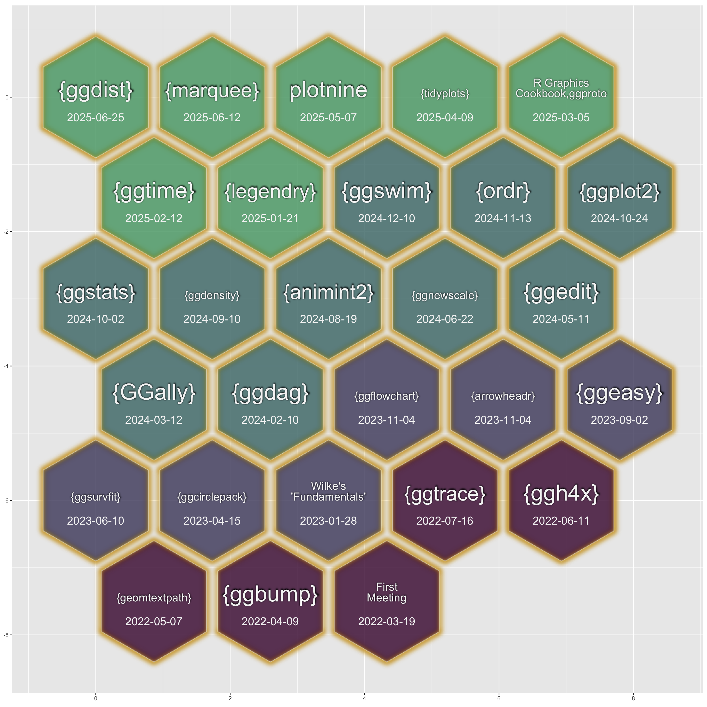 --- ### Notable: David Sjoberg (ggbump), **June Choe (ggtrace),** Claus Wilke (cowplot, ggtext, ggridgeline), Di Cook (GGally), Thomas Lin Pedersen\* (patchwork) , Winston Chang\* (ggproto extension mechanism), Teun van den Brand (ggh4x, legendry, ggplot2 maintainer), and Hadley Wickham\* (ggplot2), **Cory Brunson (ggalluvial, order), Mitchell O’Hara-Wild (ggtime, distributional), Matthew Kay\* (ggdist, ggblend),** -- ### Speakers talk about motivations, challenges, equivocations, design decision — in general, extension journeys! -- #### \* recorded talks available on our website --- ## Since spring 2024, our between-meeting discussions has also been an exciting space to exchange ideas about extension strategies and design choices! -- ### - almost 100 discussions initiated -- ### - more than 1000 contributions -- <!-- ### - Supported by Posit since March... --> --- 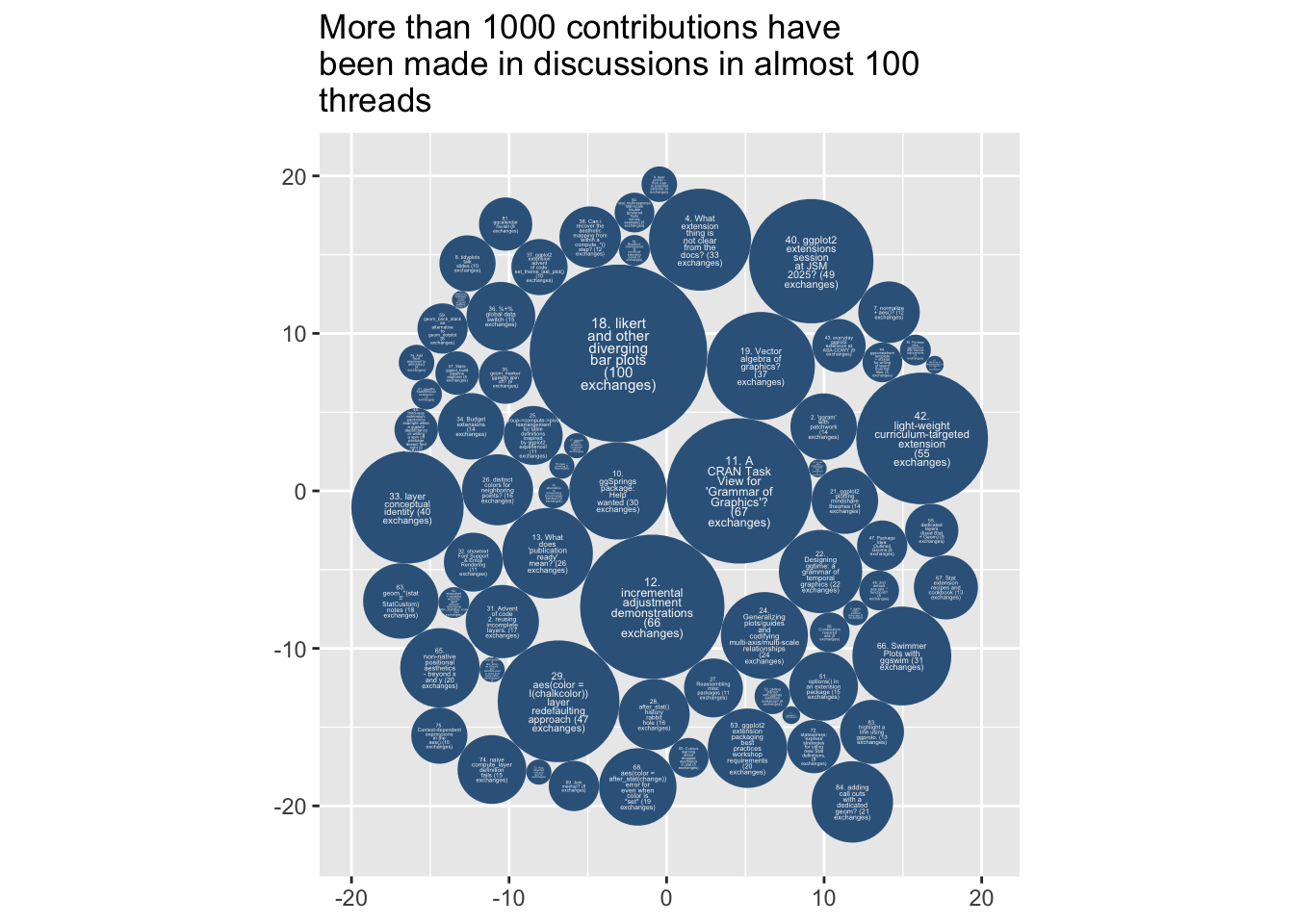{width="60%"} --- # But you may be thinking… -- ## ‘ggplot2 extenders’ … -- ## wouldn't that be for extenders? … -- ## I’m not an extender. ⛔️ --- # Maybe you have a latent extender in you… --- class: inverse, bottom background-image: url(https://images.unsplash.com/photo-1559827260-dc66d52bef19?ixlib=rb-4.0.3&ixid=M3wxMjA3fDB8MHxwaG90by1wYWdlfHx8fGVufDB8fHx8fA%3D%3D&auto=format&fit=crop&w=1470&q=80) background-size: cover --- # Part II. How do you become a ggplot2 extender? ## … we want to be more active in the education space and have more events that welcome to ggplot2 users (latent extenders). --- # Events of general interest (ggplot2 users) coming up this fall: -- ### - ggplot2 4.0.0 release party, Friday Oct 3rd 💿 -- ### - ggplot2 X LLMs (ggpal) -- ### - ggplot2 X interactivity (ggiraph with David Gohels) --- # ‘Extension is not for the faint of heart...’ -- # ‘I found extension daunting...’ -- # Education: ‘Easy geom\_\*() recipes’… aimed at beginners (ggplot2 users). <https://evamaerey.github.io/easy-geom-recipes/> --- ## Easy recipes 2025... 3 examples, 3 exercises, 3 objectives: ## - 1. Learn how to prepare compute for group-wise computation in a layer -- ## - 2. Learn how to define a Stat (and test) -- ## - 3. Learn how to combine a Stat and Geom into a user-facing function --- ## How to make it easy? ## - easy, familiar (boring) compute -- ## - step-by-step -- ## - pre step (Step 0) - connect it to what you know (get the job done with base ggplot2) --- 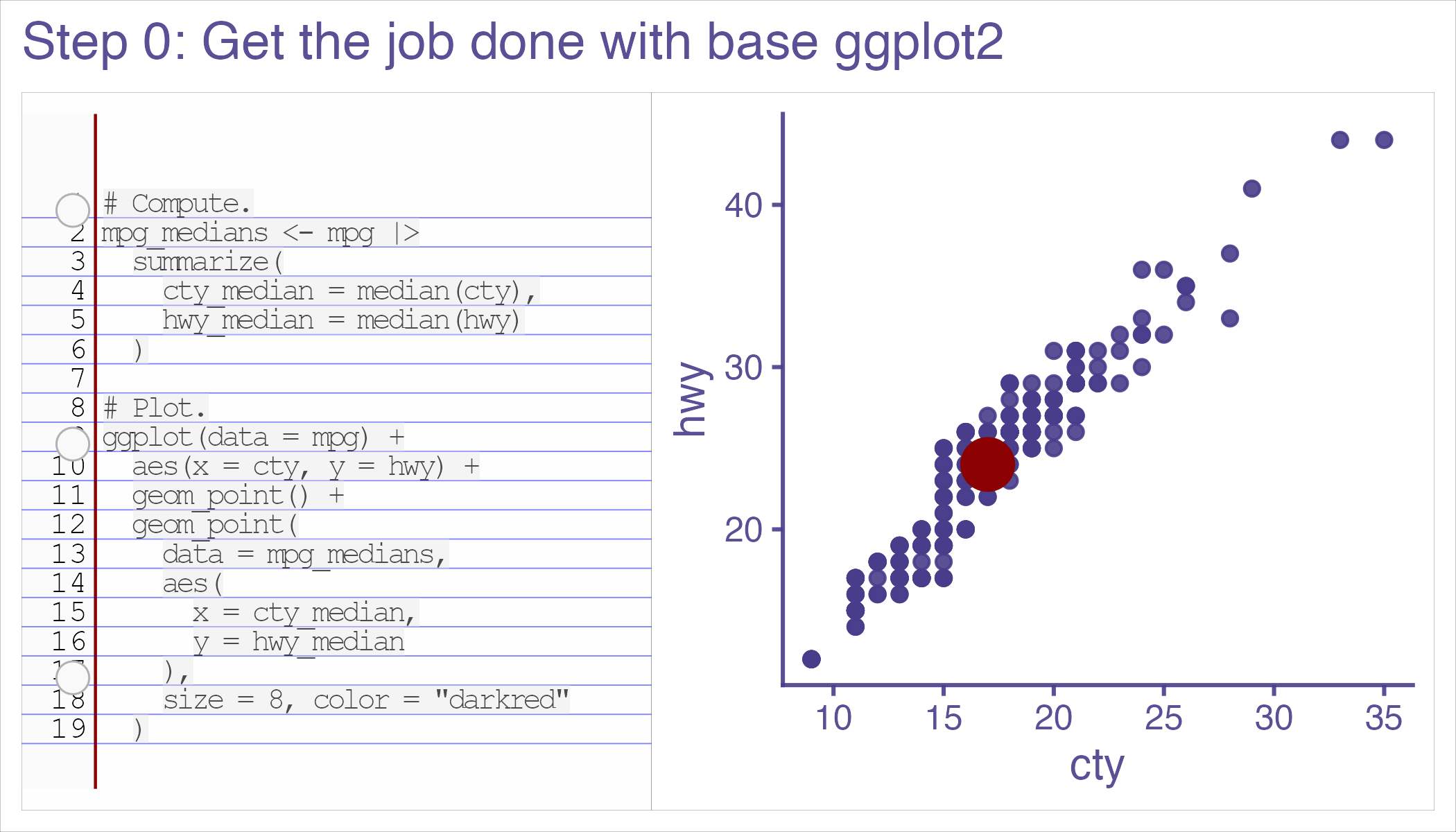 --- 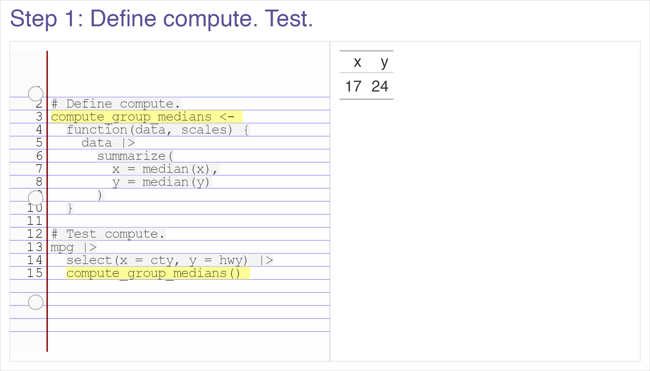 --- 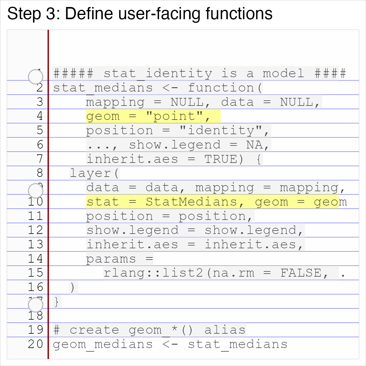 --- 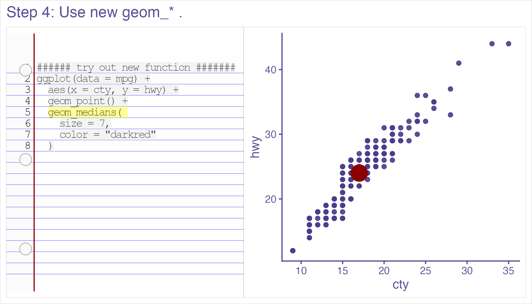 --- class: inverse, center, middle # 'Thanks for sharing these recipes! I've never written my own 'geoms' because I had no idea where to start, but with this resource I'll be putting this to use in my own work soon.' --- class: inverse, center, middle # 'Thank you for putting this into the world' Thomas Lin Pederson --- # 'Easy geom_*() recipes' ## Tested by newcomers. -- ## Vetted by other experts. -- ## Feedback refined. (survey + focus groups) -- ## Kept up-to-date. (ggplot2 4.0.0 release-aware - and now 4 examples, 4 exercises, 4 objectives...) --- class: inverse, middle, center # *'It was that easy. And I felt empowered as a result of that…. But you know, like, my problem isn’t gonna be that easy.'* --- ## Realistic! These *are* 'easy' recipes. -- ## But we have a support group for when thing are hard (ggplot2 extenders)… (and more educational resources in the works) -- # We'd be glad to see you at the extenders meetup or in our discussions!! --- class: center, middle # Thank you! # website: bit.ly/ggplot2extenders # join form: bit.ly/ggplot2extenderscontact # easy recipes: bit.ly/easy-geom-recipes --- <!-- ## --> <!-- # --> <!-- # Outline --> <!-- ## Why data visualization? (preattentive processing - effortless, efficient data communication) --> <!-- -- --> <!-- ## Why ggplot2? (effortless plot specification, like 'spontaneous language in conversation' - like should 'grammar of graphics' be 'language of graphics') --> <!-- -- --> <!-- ## Why extension? (allows for fluency to continue in domains 'base' ggplot2 doesn't support) --> <!-- -- --> <!-- ## How to support extenders (newcomers to extension)? --> <!-- - New educational material --> <!-- - & community --> <!-- <!-- ## And how the recipes came to be... --> <!-- <!-- -- --> <!-- <!-- ## What the ggplot2 4.0.0 release means for the recipes --> --\> <!-- -- --> <!-- ```{r setup, include=FALSE} --> <!-- knitr::opts_chunk$set(echo = TRUE, cache = F, warning = F, message = F) --> <!-- options(tidyverse.quiet = TRUE) --> <!-- library(flipbookr) --> <!-- library(tidyverse) --> <!-- isi_donor_url <- "https://www.isi-stats.com/isi/data/prelim/OrganDonor.txt" --> <!-- donor <- read_delim(isi_donor_url) %>% --> <!-- select(Default, Choice) %>% --> <!-- mutate(decision = ifelse(Choice == "donor", "donor (1)", "not (0)")) %>% --> <!-- mutate(decision = fct_rev(decision)) --> <!-- ``` --> <!-- ------------------------------------------------------------------------ --> <!-- ### --> <!-- Effortless consumption of information - --> <!-- 'preattentive processing' --> <!-- 1/5 of second to identify shapes, patterns, anomolies, regions of high density etc. --> <!-- -- --> <!-- With no 'hit' to cognitive resources. --> <!-- ------------------------------------------------------------------------ --> <!-- > ### "When I need to make sense of some data ... [ggplot2] continues to be just the best thing ever." -- Dewey Dunningham --> <!-- -- --> <!-- # Me: Same! ('You had me at hello'...) --> <!-- --- --> <!-- class: middle, inverse, center --> <!-- # It lets you *'speak your plot into existence'*. (Thomas Lin Pederson) (so your data can easily speak back to you! i.e. reveal patterns) --> <!-- --- --> <!-- ```{r, include = F} --> <!-- knitr::opts_chunk$set(echo = F, comment = "", message = F, --> <!-- warning = F, cache = T, fig.retina = 3) --> <!-- library(tidyverse) --> <!-- library(flipbookr) --> <!-- library(xaringanthemer) --> <!-- xaringanthemer::mono_light( --> <!-- base_color = "#02075D", --> <!-- # header_font_google = google_font("Josefin Sans"), --> <!-- # text_font_google = google_font("Montserrat", "200", "200i"), --> <!-- # code_font_google = google_font("Droid Mono"), --> <!-- text_font_size = ".85cm", --> <!-- code_font_size = ".15cm") --> <!-- theme_set(theme_gray(base_size = 20)) --> <!-- ``` --> <!-- --- --> <!-- class: inverse, center, middle --> <!-- > # "the Grammar of Graphics makes [building plots] easy because you've just got all these, like, little nice decomposable components" -- Hadley Wickham --> <!-- --- --> <!-- Hadley Wickham, on it's motivation: --> <!-- > ### And, you know, I'd get a dataset. And, *in my head I could very clearly kind of picture*, I want to put this on the x-axis. Let's put this on the y-axis, draw a line, put some points here, break it up by this variable. --> <!-- -- --> <!-- > ### And then, like, getting that vision out of my head, and into reality, it's just really, really hard. Just, like, felt harder than it should be. Like, there's a lot of custom programming involved, --> <!-- ------------------------------------------------------------------------ --> <!-- > ### where I just felt, like, to me, I just wanted to say, like, you know, *this is what I'm thinking, this is how I'm picturing this plot. Like you're the computer 'Go and do it'.* --> <!-- | | --> <!-- |----| --> <!-- | \> \### ... and I'd also been reading about the Grammar of Graphics by Leland Wilkinson, I got to meet him a couple of times and ... I was, like, this book has been, like, written for me. <https://www.trifacta.com/podcast/tidy-data-with-hadley-wickham/> | --> <!-- ```{r, include = F} --> <!-- library(tidyverse) --> <!-- library(gapminder) --> <!-- gapminder %>% # data from package --> <!-- filter(year == 2002) -> --> <!-- gapminder_2002 --> <!-- ``` --> <!-- ------------------------------------------------------------------------ --> <!-- r chunk_reveal("scatter", title = "## ggplot2 nails it...", widths = c(2,3))` --> <!-- ```{r scatter, include = F} --> <!-- ggplot(data = gapminder_2002) + --> <!-- aes(x = gdpPercap) + --> <!-- aes(y = lifeExp) + --> <!-- geom_point() + --> <!-- geom_smooth() + --> <!-- facet_wrap(vars(continent)) --> <!-- ``` --> <!-- <!-- --- --> --\> <!-- <!-- class: inverse, center, middle --> --\> <!-- <!-- > # "I'd never know quite how to get things done with matplotlib. But with ggplot2 I could understand it without even looking at documentation (paraphrase) - Hassan Kibirige (plotnine: 'grammar of graphics for python' author) --> --\> <!-- <!-- --- --> --\> <!-- <!-- # Hans Rosling & BBC in 2010 --> --\> <!-- <!-- <iframe width="767" height="431" src="https://www.youtube.com/embed/jbkSRLYSojo?list=PL6F8D7054D12E7C5A" frameborder="0" allow="accelerometer; autoplay; encrypted-media; gyroscope; picture-in-picture" allowfullscreen></iframe> --> --\> <!-- <!-- https://www.youtube.com/embed/jbkSRLYSojo?list=PL6F8D7054D12E7C5A --> --\> <!-- <!-- --- --> --\> <!-- <!-- ## ... I know having the data is not enough. I have to show it in ways people both enjoy and understand --> --\> <!-- <!-- ```{r, out.width="65%", fig.align='center'} --> --\> <!-- <!-- knitr::include_graphics("images/hans_argument.png") --> --\> <!-- <!-- ``` --> --\> <!-- <!-- --- --> --\> <!-- <!-- # 'Here we go. Life expectancy on the y-axis' --> --\> <!-- <!-- ```{r, out.width="80%"} --> --\> <!-- <!-- knitr::include_graphics("images/hans_y_axis.png") --> --\> <!-- <!-- ``` --> --\> <!-- <!-- --- --> --\> <!-- <!-- # 'On the x-axis, wealth' --> --\> <!-- <!-- ```{r, out.width="80%"} --> --\> <!-- <!-- knitr::include_graphics("images/hans_x_axis.png") --> --\> <!-- <!-- ``` --> --\> <!-- <!-- --- --> --\> <!-- <!-- # 'Colors represent the different continents' --> --\> <!-- <!-- ```{r, out.width="80%"} --> --\> <!-- <!-- knitr::include_graphics("images/hans_colors.png") --> --\> <!-- <!-- ``` --> --\> <!-- <!-- --- --> --\> <!-- <!-- # 'Size represents population' --> --\> <!-- <!-- ```{r, out.width="80%"} --> --\> <!-- <!-- knitr::include_graphics("images/hans_size.png") --> --\> <!-- <!-- ``` --> --\> <!-- <!-- --- --> --\> <!-- <!-- class: inverse, center, middle --> --\> <!-- <!-- # Response to speaking plot into existence? --> --\> <!-- <!-- -- --> --\> <!-- <!-- # 10 million views... --> --\> <!-- <!-- -- --> --\> <!-- <!-- (also does animation at the end... which I don't show) --> --\> <!-- <!-- --- --> --\> <!-- ```{r, out.width="45%"} --> <!-- knitr::include_graphics("../../ggram/transcriber_of_imagined_plots.png") --> <!-- ``` --> <!-- ------------------------------------------------------------------------ --> <!-- ## But, sometimes we don't have the vocabulary that's needed to keep 'speaking' fluently. --> <!-- ------------------------------------------------------------------------ --> <!-- ## Example: What's the graphical poem here? --> <!-- ```{r, echo = F} --> <!-- library(ggplot2) --> <!-- ggplot(airquality) + --> <!-- aes(x = Ozone) + --> <!-- geom_rug() + --> <!-- geom_histogram() + --> <!-- ggxmean::geom_x_mean() --> <!-- ``` --> <!-- ??? Consider for example, a the seemingly simple enterprise of adding a vertical line at the mean of x, perhaps atop a histogram or density plot. --> <!-- ------------------------------------------------------------------------ --> <!-- r chunk_reveal("basic", title = "### What's the *base* ggplot2 experience")` --> <!-- ```{r basic} --> <!-- airquality %>% --> <!-- ggplot(data = .) + --> <!-- aes(x = Ozone) + --> <!-- geom_rug() + --> <!-- geom_histogram() + --> <!-- geom_vline( --> <!-- xintercept = --> <!-- mean(airquality$Ozone, --> <!-- na.rm = T) --> <!-- ) -> --> <!-- g --> <!-- ``` --> <!-- ??? Creating this plot requires greater focus on ggplot2 *syntax*, likely detracting from discussion of *the mean* that statistical instructors desire. It may require a discussion about dollar sign syntax and how geom_vline is actually a special geom -- an annotation -- rather than being mapped to the data. None of this is relevant to the point you as an instructor aim to make: maybe that the the mean is the balancing point of the data or maybe a comment about skewness. --> <!-- ------------------------------------------------------------------------ --> <!-- ### Adding the conditional means? --> <!-- ```{r cond_means_hard, echo = F} --> <!-- airquality %>% --> <!-- group_by(Month) %>% --> <!-- summarise( --> <!-- Ozone_mean = --> <!-- mean(Ozone, na.rm = T) --> <!-- ) -> --> <!-- airquality_by_month --> <!-- ggplot(airquality) + --> <!-- aes(x = Ozone) + --> <!-- geom_histogram() + --> <!-- facet_grid(rows = vars(Month)) + --> <!-- geom_vline(data = airquality_by_month, --> <!-- aes(xintercept = --> <!-- Ozone_mean)) --> <!-- ``` --> <!-- ??? --> <!-- Further, for the case of adding a vertical line at the mean for different subsets of the data, a different approach is required. This enterprise may take instructor/analyst/student on an even larger detour -- possibly googling, and maybe landing on the following stack overflow page where 11,000 analytics souls (some repeats to be sure) have landed: --> <!-- ------------------------------------------------------------------------ --> <!-- r chunk_reveal("cond_means_hard", title = "#### Conditional means (may require a trip to stackoverflow!)")` --> <!-- ------------------------------------------------------------------------ --> <!-- # Why is something like geom_smooth() is so easy, and my mean of x line is so hard? --> <!-- ------------------------------------------------------------------------ --> <!-- ## ggbump --> <!-- ```{r, echo = F} --> <!-- library(tidyverse) --> <!-- theme_set(theme_gray(base_size = 18)) --> <!-- us_and_peers <- c("United States", "Germany", --> <!-- "United Kingdom", "France", --> <!-- "Canada") --> <!-- gapminder::gapminder %>% --> <!-- filter(country %in% us_and_peers) %>% --> <!-- mutate(life_exp_rank = rank(-lifeExp), --> <!-- .by = year) -> --> <!-- us_cohort_life_exp_rank_2020 --> <!-- ``` --> <!-- ------------------------------------------------------------------------ --> <!-- r chunk_reveal("bump")` --> <!-- ```{r bump, include = F} --> <!-- library(tidyverse) --> <!-- library(ggbump) --> <!-- us_cohort_life_exp_rank_2020 %>% --> <!-- ggplot() + --> <!-- aes(x = year) + --> <!-- aes(y = life_exp_rank) + --> <!-- geom_point() + --> <!-- aes(color = country) + --> <!-- geom_bump() #<< --> <!-- ``` --> <!-- ------------------------------------------------------------------------ --> <!-- # Snappy Graphical Poem!!! --> <!-- -- --> <!-- # Some nice plot Ar.ti.cu.la.tion! --> <!-- -- --> <!-- # Grateful when plot composition is *staccato*. --> <!-- ```{r, eval = F} --> <!-- life_exp_rank_2020 %>% --> <!-- ggplot() + --> <!-- aes(x = year, --> <!-- y = life_exp_rank, --> <!-- color = country) + --> <!-- geom_point() + --> <!-- geom_bump() #<< --> <!-- ``` --> <!-- ------------------------------------------------------------------------ --> <!-- ## Saw Thomas Lin Pederson's talk 'Extending your ability to extend ggplot2' January 2020 geom_circle() - (live at RStudio::Conf) --> <!-- -- --> <!-- #### and tried --> <!-- -- --> <!-- #### and failed --> <!-- -- --> <!-- #### and tried --> <!-- -- --> <!-- #### and failed --> <!-- -- --> <!-- #### and kind of figured things out in December 2020.... --> <!-- -- --> <!-- And it was everything I'd hoped for! --> <!-- ------------------------------------------------------------------------ --> <!-- My experience, might be pretty typical... 2x I've heard folks say 'extension is not for the faint of heart'. --> <!-- ------------------------------------------------------------------------ --> <!-- # Wanted to fit in more extension to my life --> <!-- -- --> <!-- ## Fall 2021 Independent studies... <https://github.com/EvaMaeRey/ay_2022_2_advanced_individual_study-> --> <!-- ### - `geom_high_leverage` Morgan --> <!-- ### - `geom_high_influence` Madison --> <!-- ------------------------------------------------------------------------ --> <!-- ## Spring 2022 independent study: make a tutorial. --> <!-- ### w/ Morgan: 'a no-struggle introduction to layer extension, for unsophisticated ggplot2 users' --> <!-- ------------------------------------------------------------------------ --> <!-- ## 3 examples, 3 exercises, 3 objectives: --> <!-- -- --> <!-- ## - 1. Learn how to prepare compute for group-wise computation in a layer --> <!-- -- --> <!-- ## - 2. Learn how to define a Stat (and test) --> <!-- -- --> <!-- ## - 3. Learn how to combine a Stat and Geom into a user-facing function --> <!-- ------------------------------------------------------------------------ --> <!-- ## How to make it easy? --> <!-- ## - easy, familiar (boring) compute --> <!-- -- --> <!-- ## - step-by-step --> <!-- -- --> <!-- ## - pre step (Step 0) - connect it to what you know (get the job done with base ggplot2) --> <!-- ------------------------------------------------------------------------ --> <!-- # Stat-based geom\_\*() functions is focus. Why? --> <!-- ## - Stats are easy\* --> <!-- -- --> <!-- ## - `geoms_\*()`s are familiar --> <!-- -- --> <!-- - relatively easy compared to Geoms and position... --> <!-- ------------------------------------------------------------------------ --> <!-- # Stat-based geom\_\*() functions is focus. Why? --> <!-- #### \> I've used ggplot for a very long time... Conceptually I get `$$the difference between `stat_*()` functions and `geom_()*`s functions.$$` But... I would not put `+ stat_*()` anything. That's not something I would naturally do after using the gg platform... for 10 years. --> <!-- ------------------------------------------------------------------------ --> <!-- ## In 2023, survey, focus group about bare-bones, download a .Rmd --> <!-- -- --> <!-- ## 2024 Moved to webr/quarto, added explanation (I didn't really have much vocabulary in 2023!) --> <!-- -- --> <!-- ## May 2025 survey + focus group... --> <!-- ------------------------------------------------------------------------ --> <!-- ## Participant profile --> <!-- ```{r, echo = F, fig.show='hold', out.width="25%"} --> <!-- files <- fs::dir_ls("../../posit-consulting/report_figures/") --> <!-- knitr::include_graphics(path = files[1]) --> <!-- knitr::include_graphics(path = files[2]) --> <!-- knitr::include_graphics(path = files[3]) --> <!-- knitr::include_graphics(path = files[4]) --> <!-- knitr::include_graphics(path = files[5]) --> <!-- knitr::include_graphics(path = files[6]) --> <!-- knitr::include_graphics(path = files[7]) --> <!-- knitr::include_graphics(path = files[8]) --> <!-- ``` --> <!-- ------------------------------------------------------------------------ --> <!-- ```{r} --> <!-- knitr::include_graphics("../../posit-consulting/step0.png") --> <!-- ``` --> <!-- ------------------------------------------------------------------------ --> <!-- ```{r} --> <!-- knitr::include_graphics("../../posit-consulting/step1.png") --> <!-- ``` --> <!-- ------------------------------------------------------------------------ --> <!-- ```{r} --> <!-- knitr::include_graphics("../../posit-consulting/step3.png") --> <!-- ``` --> <!-- ------------------------------------------------------------------------ --> <!-- ```{r} --> <!-- knitr::include_graphics("../../posit-consulting/done.png") --> <!-- ``` --> <!-- ------------------------------------------------------------------------ --> <!-- ## Participant feedback --> <!-- ```{r, echo = F, fig.show='hold'} --> <!-- files <- fs::dir_ls("../../posit-consulting/report_figures/") --> <!-- knitr::include_graphics(path = files[11]) --> <!-- knitr::include_graphics(path = files[12]) --> <!-- knitr::include_graphics(path = files[13]) --> <!-- knitr::include_graphics(path = files[14]) --> <!-- knitr::include_graphics(path = files[15]) --> <!-- knitr::include_graphics(path = files[16]) --> <!-- knitr::include_graphics(path = files[17]) --> <!-- knitr::include_graphics(path = files[18]) --> <!-- ``` --> <!-- ------------------------------------------------------------------------ --> <!-- # 'You are here 𐄂' --> <!-- -- --> <!-- ## Now 'easy geom recipes' X July 2025 release --> <!-- -- --> <!-- ggplot2 release party at ggplot2 extenders meetup. --> <!-- ------------------------------------------------------------------------ --> <!-- > # It was that easy. And I felt empowered as a result of that…. But you know, like, my problem isn’t gonna be that easy. --> <!-- ------------------------------------------------------------------------ --> <!-- Support group... --> <!-- ------------------------------------------------------------------------ --> <!-- ------------------------------------------------------------------------ --> <!-- # In next ggplot2 release --> <!-- ```{r, echo = F} --> <!-- library(ggplot2) --> <!-- StatMedians <- ggproto("StatMedians", Stat) --> <!-- ``` --> <!-- ------------------------------------------------------------------------ --> <!-- > #### 'take care to match the argument order and naming used in the ggplot2’s constructors so you don’t surprise your users.' --> <!-- -- --> <!-- #### Writing user-facing function will get so easy! (and maybe a little more mysterious...) --> <!-- ```{r, eval = T, echo = T} --> <!-- stat_medians <- make_constructor(StatMedians, geom = "point") --> <!-- geom_medians <- make_constructor(GeomPoint, stat = "medians") --> <!-- geom_medians --> <!-- ``` --> <!-- ------------------------------------------------------------------------ --> <!-- ### Also, --> <!-- -- --> <!-- ### 'I've opened a PR for adding a 'manual' stat, where essentially the compute_group() method is available to the user. --> <!-- ### Probably a lot of your recipes work there as well, without having to actually build a Stat :)' - Teun in extenders discussions Sept 2024 --> <!-- <https://github.com/tidyverse/ggplot2/pull/6143> --> <!-- ------------------------------------------------------------------------ --> <!-- ### ggplot2 4.0.0 Epilogue: our vline at mean of x motivating example w/ ggplot2 4.0.0 stat_manual... Not bad! --> <!-- ```{r, echo = T, fig.show="hold", out.width="25%"} --> <!-- library(ggplot2) --> <!-- ggplot(airquality) + --> <!-- aes(x = Ozone) + --> <!-- geom_histogram() + --> <!-- stat_manual(geom = GeomVline, --> <!-- fun = ~ summarize(.x, xintercept = mean(x, na.rm = T))) --> <!-- last_plot() + --> <!-- facet_grid(rows = vars(Month)) --> <!-- ``` --> <!-- ------------------------------------------------------------------------ --> <!-- ## Willing to type a tad more: `geom_xmean` 'easy recipes approach' X ggplot2 4.0.0's make_constructor()? --> <!-- ```{r, fig.show="hold"} --> <!-- compute_means <- function(data, scales){ --> <!-- data |> summarise(xintercept = mean(x, na.rm = T)) --> <!-- } --> <!-- StatXmean <- ggproto("StatXmean", --> <!-- Stat, --> <!-- compute_group = compute_means, --> <!-- required_aes = "x") --> <!-- geom_xmean <- make_constructor(GeomVline, stat = StatXmean) --> <!-- ``` --> <!-- ------------------------------------------------------------------------ --> <!-- # --\> the ggplot2 experience! --> <!-- ```{r, out.width="25%", echo= T, fig.show='hold'} --> <!-- ggplot(airquality) + --> <!-- aes(x = Ozone) + --> <!-- geom_histogram() + --> <!-- geom_xmean() #<< --> <!-- last_plot() + --> <!-- facet_grid(rows = vars(Month)) --> <!-- ``` --> <!-- ------------------------------------------------------------------------ --> <!-- ## But, stat_manual made me feel I should cover more territory (lest you ask why do I need the recipes, I can get everything done w/ stat_manual) --> <!-- -- --> <!-- So now there are 4 recipes, where compute_panel is introduced (not just compute_group) in recipe 2 and used in 3 and 4. --> <!-- ------------------------------------------------------------------------ --> <!-- New questions... --> <!-- ## Are `compute_panel` recipes they still accessible, interesting enough, correct? --> <!-- -- --> <!-- ## Do you still feel motivated by `compute_group` Stat example given stat_manual? --> <!-- ------------------------------------------------------------------------ --> <!-- > Wait, why did we do a Stat and not a Geom like, like ... the tutorial starts with, you're gonna make a geom\_*() but I made a stat\_*(). --> <!-- ------------------------------------------------------------------------ --> <!-- > **Participant H** I just think that it's weird to have two things that live at the `$$same level$$`, because ultimately they all filter down to layer. And it's really a layer that you're creating. --> <!-- ------------------------------------------------------------------------ --> <!-- > **Participant D** There's a sense in which also, like, you feel that maybe everything should just be 'layer\_'. But the problem is that nobody actually does that in practice. And so, you know, you would be teaching something, and it would be kind of a ggplot variant that nobody else really uses. --> <!-- ------------------------------------------------------------------------ --> <!-- > 'Stat objects are almost always paired with a geom\_\*() constructor because most ggplot2 users are accustomed to adding geom\_\*()s, not stat\_\*()s, when building up a plot.' - ggplot2 book, Extension springs case study --> <!-- ```{r} --> <!-- knitr::include_graphics("../../posit-consulting/report_figures/unnamed-chunk-35-1.svg") --> <!-- ``` --> <!-- ------------------------------------------------------------------------ --> <!-- ```{r} --> <!-- knitr::include_graphics("../../posit-consulting/report_figures/unnamed-chunk-35-2.svg") --> <!-- ``` --> <!-- ------------------------------------------------------------------------ --> <!-- ```{r} --> <!-- knitr::include_graphics("../../posit-consulting/report_figures/unnamed-chunk-35-3.svg") --> <!-- ``` -->