class: center, middle, inverse, title-slide # diff-in-diff vis w ggplot ### Evangeline Reynolds ### 5/18/2018 --- ```r knitr::opts_chunk$set(warning = F, message = F) library(flipbookr) ``` Using a difference-in-difference framework to look at the effect of policy interventions is a popular research design. A binary exlanatory variable that turns on and stays on lends itself to ease of interpretation! In the context of such a design, what is the essential visual inspections? Below I suggest four plots that researchers and their audiences may find useful in visually inspecting the timing of interventions and the relationships between a policy intervention and outcomes. I use ggplot2 to implement the visualization. The ability to overwrite global aesthetics, using the aes() function, means that we move from one plot to another with little additional code. A little over a year ago I learned about declaring the aes() on it's own line and maybe novelty bias is at work here, but I find the capability to be a lot of fun to play with! --- The five plots are as follows: - two plots showing the timing of intervention and the cross-sectional cases (one aligning the moments of interventions) - two plots showing how the intervention relates to the response variable of interest (one aligning the moments of interventions) - a plot that breaks up the data into individual time-series for the response variable for each cross-sectional unit Another option for visualizing such data is using the new package [panelView](http://yiqingxu.org/software/panelView/panelView.html), which certainly gave me additional inspiration for this exercise and looks useful! ```r library(tidyverse) library(gapminder) ``` # Simulating interventions We'll just use --- ```r min_year <- min(gapminder$year) max_year <- max(gapminder$year) span <- max_year - min_year gapminder %>% select(country) %>% distinct() %>% sample_frac(.5) %>% mutate(intervention_year = runif(n = n(), min = min_year, max = max_year + span)) %>% mutate(intervention_year = ifelse(max_year < intervention_year, NA, intervention_year)) %>% mutate(intervention_year = round(intervention_year)) %>% sample_n(16) -> synthetic_interventions ``` --- ```r synthetic_interventions %>% inner_join(gapminder) %>% mutate(treatment = case_when( year >= intervention_year ~ "treated", year < intervention_year ~ "not treated", is.na(intervention_year) ~ "not treated")) %>% group_by(country) %>% mutate(mean_treated = mean(treatment == "treated")) %>% arrange(mean_treated) %>% ungroup() %>% mutate(country = forcats::fct_inorder(as.character(country))) -> panel_prepped ``` --- class: split-40 count: false .column[.content[ ```r *ggplot(panel_prepped) ``` ]] .column[.content[ <!-- --> ]] --- class: split-40 count: false .column[.content[ ```r ggplot(panel_prepped) + * aes(x = year) ``` ]] .column[.content[ <!-- --> ]] --- class: split-40 count: false .column[.content[ ```r ggplot(panel_prepped) + aes(x = year) + * aes(y = country) ``` ]] .column[.content[ <!-- --> ]] --- class: split-40 count: false .column[.content[ ```r ggplot(panel_prepped) + aes(x = year) + aes(y = country) + * aes(group = country) ``` ]] .column[.content[ <!-- --> ]] --- class: split-40 count: false .column[.content[ ```r ggplot(panel_prepped) + aes(x = year) + aes(y = country) + aes(group = country) + * labs(caption = "Four essential plots for diff-in-diff | Gina Reynolds") ``` ]] .column[.content[ <!-- --> ]] --- class: split-40 count: false .column[.content[ ```r ggplot(panel_prepped) + aes(x = year) + aes(y = country) + aes(group = country) + labs(caption = "Four essential plots for diff-in-diff | Gina Reynolds") + * geom_line(alpha = .5) ``` ]] .column[.content[ <!-- --> ]] --- class: split-40 count: false .column[.content[ ```r ggplot(panel_prepped) + aes(x = year) + aes(y = country) + aes(group = country) + labs(caption = "Four essential plots for diff-in-diff | Gina Reynolds") + geom_line(alpha = .5) + * geom_point(size = 1.5) ``` ]] .column[.content[ <!-- --> ]] --- class: split-40 count: false .column[.content[ ```r ggplot(panel_prepped) + aes(x = year) + aes(y = country) + aes(group = country) + labs(caption = "Four essential plots for diff-in-diff | Gina Reynolds") + geom_line(alpha = .5) + geom_point(size = 1.5) + * aes(color = treatment) ``` ]] .column[.content[ <!-- --> ]] --- class: split-40 count: false .column[.content[ ```r ggplot(panel_prepped) + aes(x = year) + aes(y = country) + aes(group = country) + labs(caption = "Four essential plots for diff-in-diff | Gina Reynolds") + geom_line(alpha = .5) + geom_point(size = 1.5) + aes(color = treatment) + * theme_minimal() ``` ]] .column[.content[ <!-- --> ]] --- class: split-40 count: false .column[.content[ ```r ggplot(panel_prepped) + aes(x = year) + aes(y = country) + aes(group = country) + labs(caption = "Four essential plots for diff-in-diff | Gina Reynolds") + geom_line(alpha = .5) + geom_point(size = 1.5) + aes(color = treatment) + theme_minimal() + * scale_color_manual(values = c("lightgrey", "steelblue4")) ``` ]] .column[.content[ <!-- --> ]] --- class: split-40 count: false .column[.content[ ```r ggplot(panel_prepped) + aes(x = year) + aes(y = country) + aes(group = country) + labs(caption = "Four essential plots for diff-in-diff | Gina Reynolds") + geom_line(alpha = .5) + geom_point(size = 1.5) + aes(color = treatment) + theme_minimal() + scale_color_manual(values = c("lightgrey", "steelblue4")) + * labs(color = NULL) ``` ]] .column[.content[ 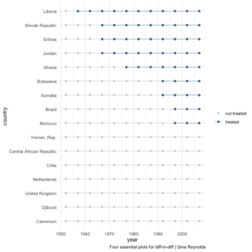<!-- --> ]] --- class: split-40 count: false .column[.content[ ```r ggplot(panel_prepped) + aes(x = year) + aes(y = country) + aes(group = country) + labs(caption = "Four essential plots for diff-in-diff | Gina Reynolds") + geom_line(alpha = .5) + geom_point(size = 1.5) + aes(color = treatment) + theme_minimal() + scale_color_manual(values = c("lightgrey", "steelblue4")) + labs(color = NULL) + * labs(x = NULL) ``` ]] .column[.content[ <!-- --> ]] --- class: split-40 count: false .column[.content[ ```r ggplot(panel_prepped) + aes(x = year) + aes(y = country) + aes(group = country) + labs(caption = "Four essential plots for diff-in-diff | Gina Reynolds") + geom_line(alpha = .5) + geom_point(size = 1.5) + aes(color = treatment) + theme_minimal() + scale_color_manual(values = c("lightgrey", "steelblue4")) + labs(color = NULL) + labs(x = NULL) + * labs(y = "country") ``` ]] .column[.content[ <!-- --> ]] --- class: split-40 count: false .column[.content[ ```r ggplot(panel_prepped) + aes(x = year) + aes(y = country) + aes(group = country) + labs(caption = "Four essential plots for diff-in-diff | Gina Reynolds") + geom_line(alpha = .5) + geom_point(size = 1.5) + aes(color = treatment) + theme_minimal() + scale_color_manual(values = c("lightgrey", "steelblue4")) + labs(color = NULL) + labs(x = NULL) + labs(y = "country") + * labs(title = "Plot 1: Treatment-control summary") ``` ]] .column[.content[ 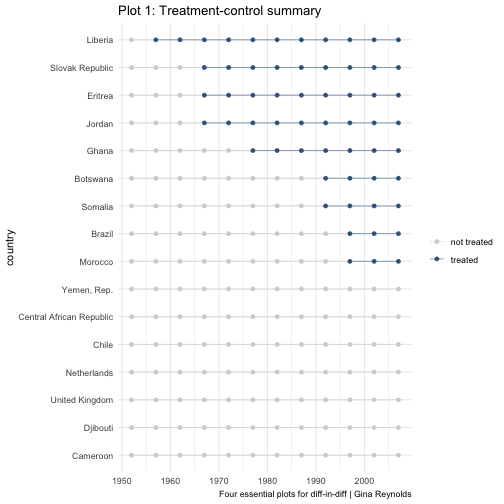<!-- --> ]] --- class: split-40 count: false .column[.content[ ```r ggplot(panel_prepped) + aes(x = year) + aes(y = country) + aes(group = country) + labs(caption = "Four essential plots for diff-in-diff | Gina Reynolds") + geom_line(alpha = .5) + geom_point(size = 1.5) + aes(color = treatment) + theme_minimal() + scale_color_manual(values = c("lightgrey", "steelblue4")) + labs(color = NULL) + labs(x = NULL) + labs(y = "country") + labs(title = "Plot 1: Treatment-control summary") + * # overwriting y position mapping * aes(y = gdpPercap) + * scale_y_log10() + * labs(y = "GDP per cap") + * labs(title = "Plot 2: Treatment-control response overlaid summary") ``` ]] .column[.content[ 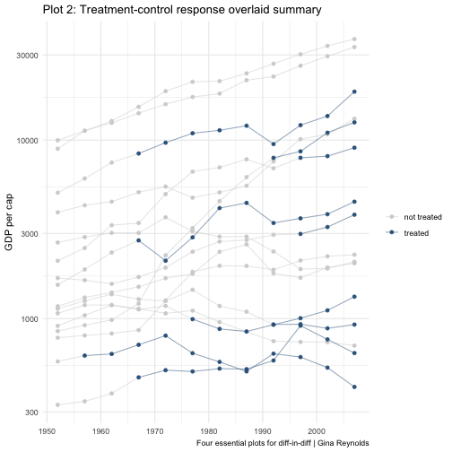<!-- --> ]] --- class: split-40 count: false .column[.content[ ```r ggplot(panel_prepped) + aes(x = year) + aes(y = country) + aes(group = country) + labs(caption = "Four essential plots for diff-in-diff | Gina Reynolds") + geom_line(alpha = .5) + geom_point(size = 1.5) + aes(color = treatment) + theme_minimal() + scale_color_manual(values = c("lightgrey", "steelblue4")) + labs(color = NULL) + labs(x = NULL) + labs(y = "country") + labs(title = "Plot 1: Treatment-control summary") + # overwriting y position mapping aes(y = gdpPercap) + scale_y_log10() + labs(y = "GDP per cap") + labs(title = "Plot 2: Treatment-control response overlaid summary") + * # overwriting x position mapping * aes(x = year - intervention_year) + * labs(x = "year from intervention year") + * labs(title = "Plot 3: Treatment-control response overlaid summary, aligned intervention") ``` ]] .column[.content[ 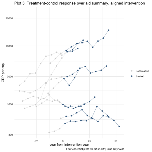<!-- --> ]] --- class: split-40 count: false .column[.content[ ```r ggplot(panel_prepped) + aes(x = year) + aes(y = country) + aes(group = country) + labs(caption = "Four essential plots for diff-in-diff | Gina Reynolds") + geom_line(alpha = .5) + geom_point(size = 1.5) + aes(color = treatment) + theme_minimal() + scale_color_manual(values = c("lightgrey", "steelblue4")) + labs(color = NULL) + labs(x = NULL) + labs(y = "country") + labs(title = "Plot 1: Treatment-control summary") + # overwriting y position mapping aes(y = gdpPercap) + scale_y_log10() + labs(y = "GDP per cap") + labs(title = "Plot 2: Treatment-control response overlaid summary") + # overwriting x position mapping aes(x = year - intervention_year) + labs(x = "year from intervention year") + labs(title = "Plot 3: Treatment-control response overlaid summary, aligned intervention") + * # overwriting x position mapping again * aes(x = year) + * labs(x = NULL) + * scale_y_continuous() + * labs(title = "Plot 4: Treatment-Response faceted") + * facet_wrap(~ country) ``` ]] .column[.content[ 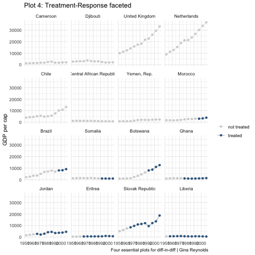<!-- --> ]] <style type="text/css"> .remark-code{line-height: 1.5; font-size: 50%} </style>