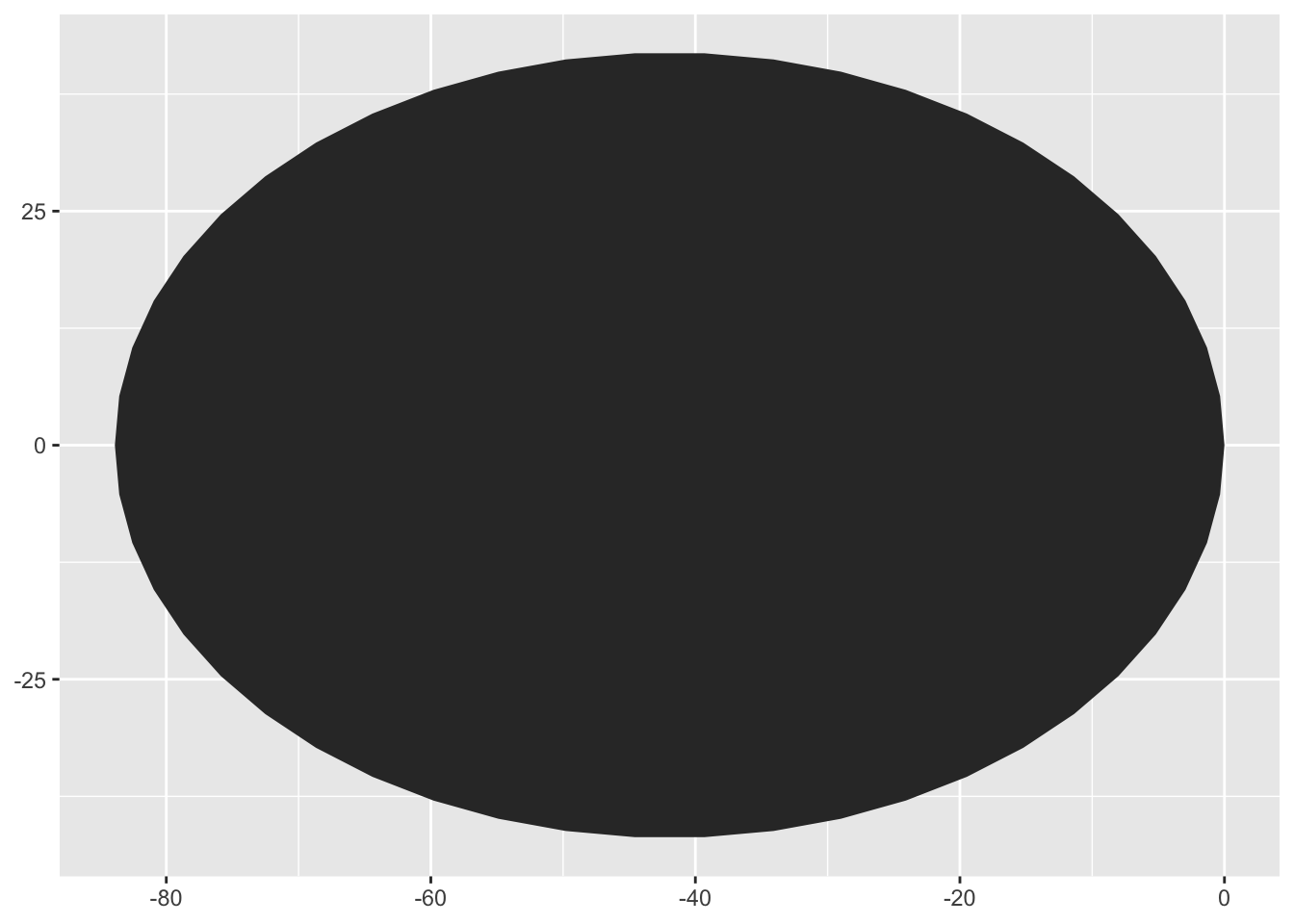
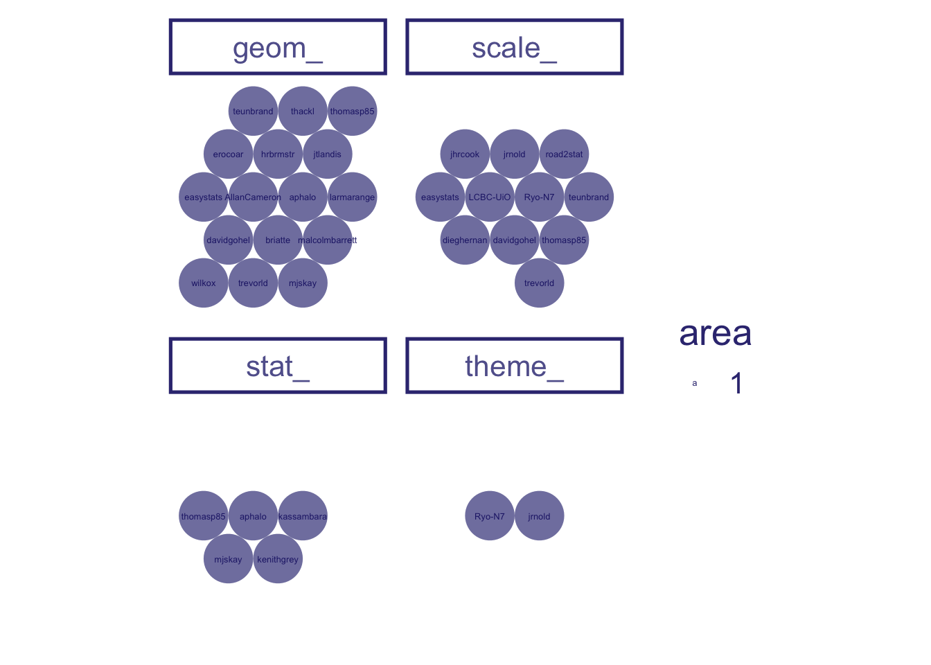
the data frame to be plotted is all the exported functions from the , using ggplot(data = user_repo_fun)
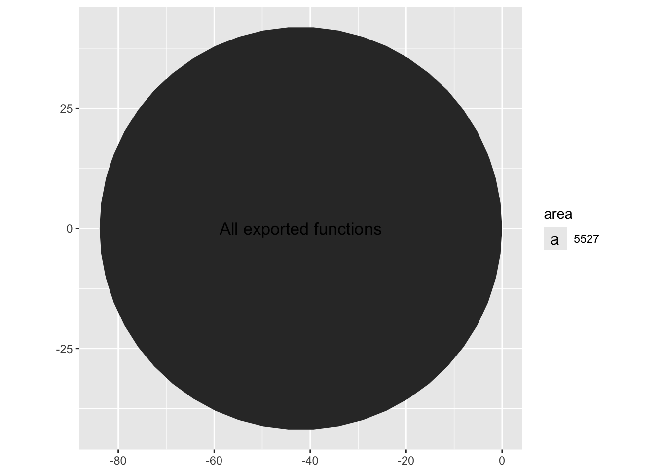
let’s look at a count of all the exported functions first, using aes(id = "All exported functions")
Using circlepacking, we automatically have circles size representing the number of observation, i.e. exported functions, using ggcirclepack::geom_circlepack()
Of course this is hard to interpret without some kind of label. We use geom_circplepack_text to do this for us, using ggcirclepack::geom_circlepack_text()
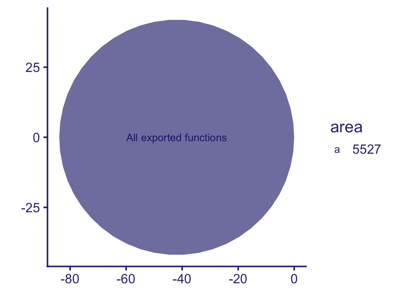
and lets square up the circles, using coord_equal()
we’ll add a theme, using ggchalkboard:::theme_glassboard()
And remove axes… , using theme(axis.line = element_blank(), axis.text = element_blank(), axis.ticks = element_blank())
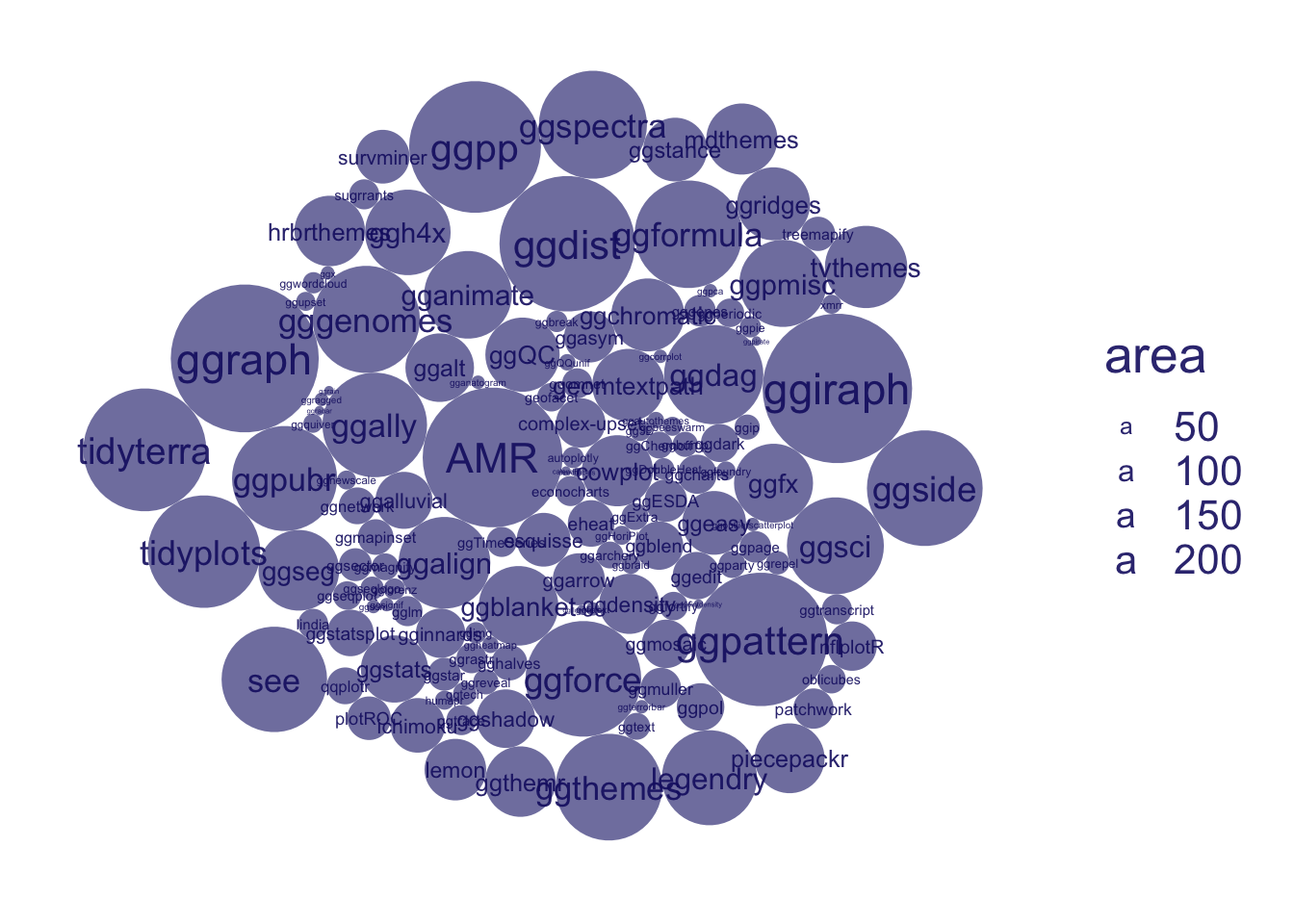
First we ask what packages - github repository names - are present, using aes(id = repo)
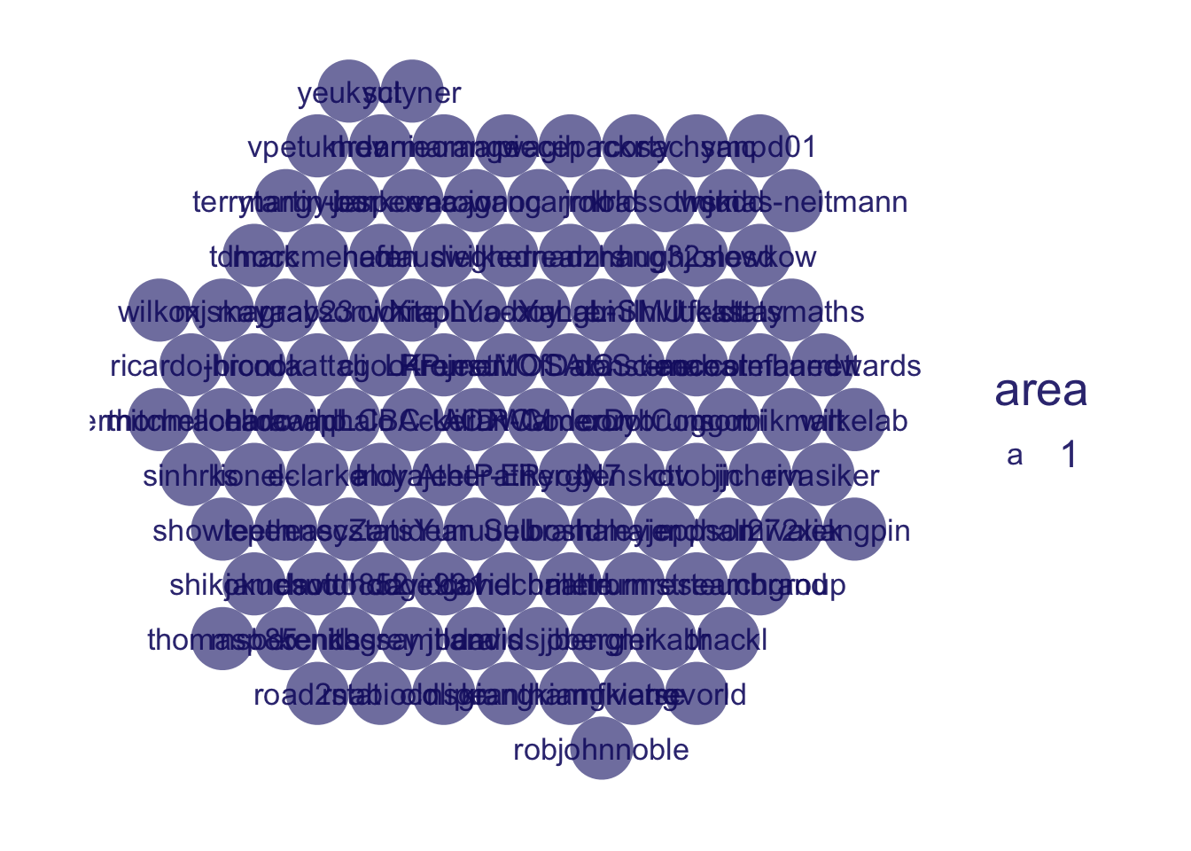
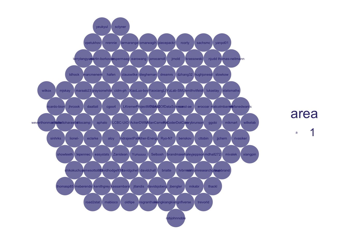
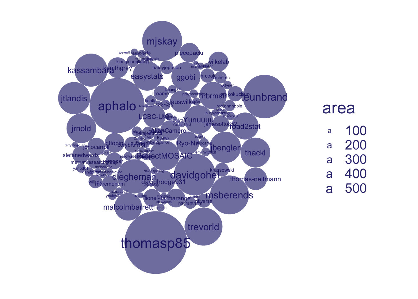
Then let’s look at who is writing these exported functions, using aes(id = user)
an extender’s an extender no matter how small, using data_nest(.by = user)
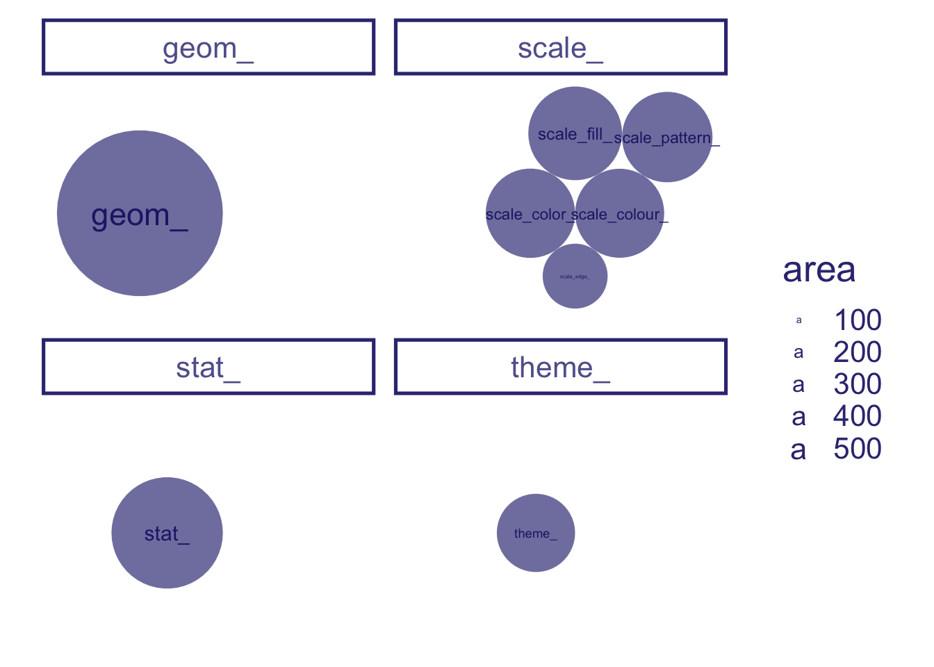
shrink sizes, using scale_size(range = 1.75)
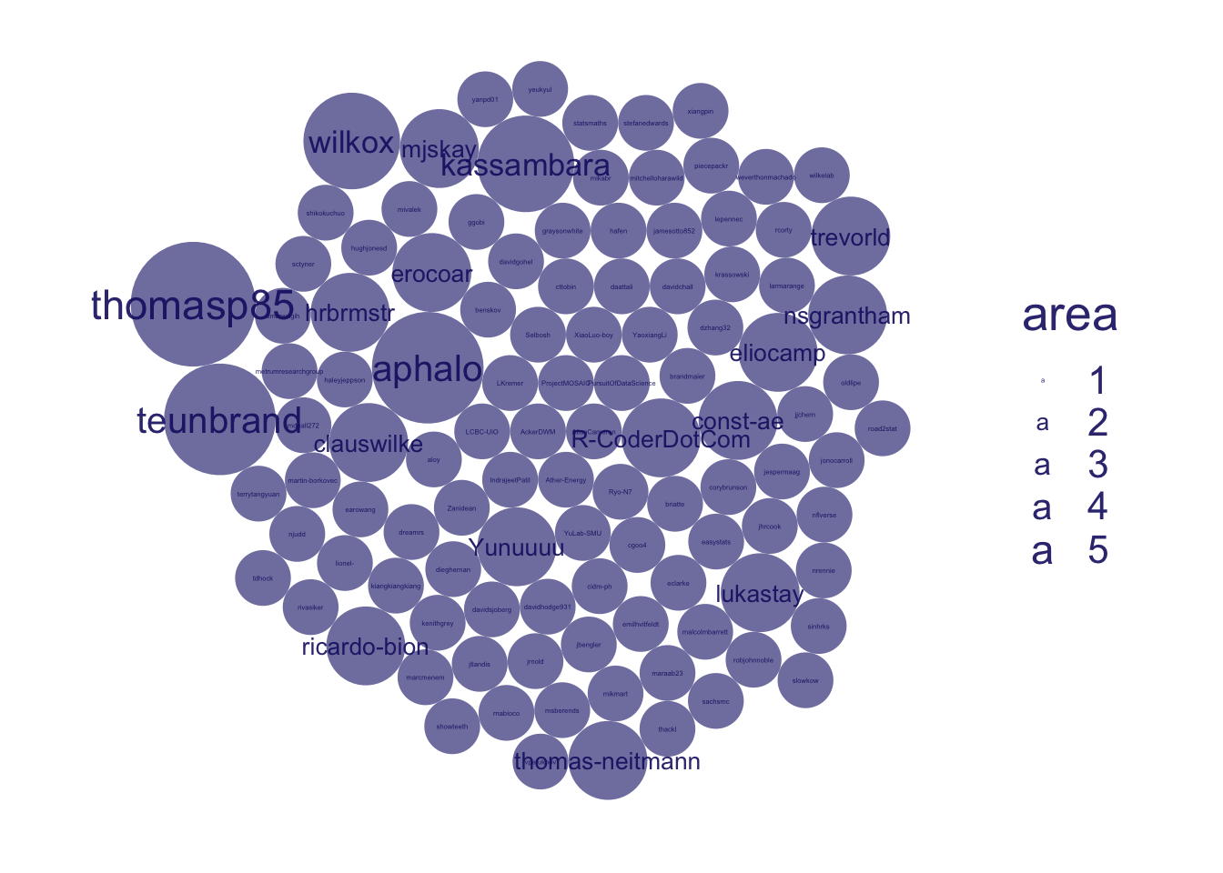
extender by number of repos, using data_unnest() + data_nest(.by = c(user, repo))
back to default size scales, using scale_size()
back to record per extender (user), using data_unnest()
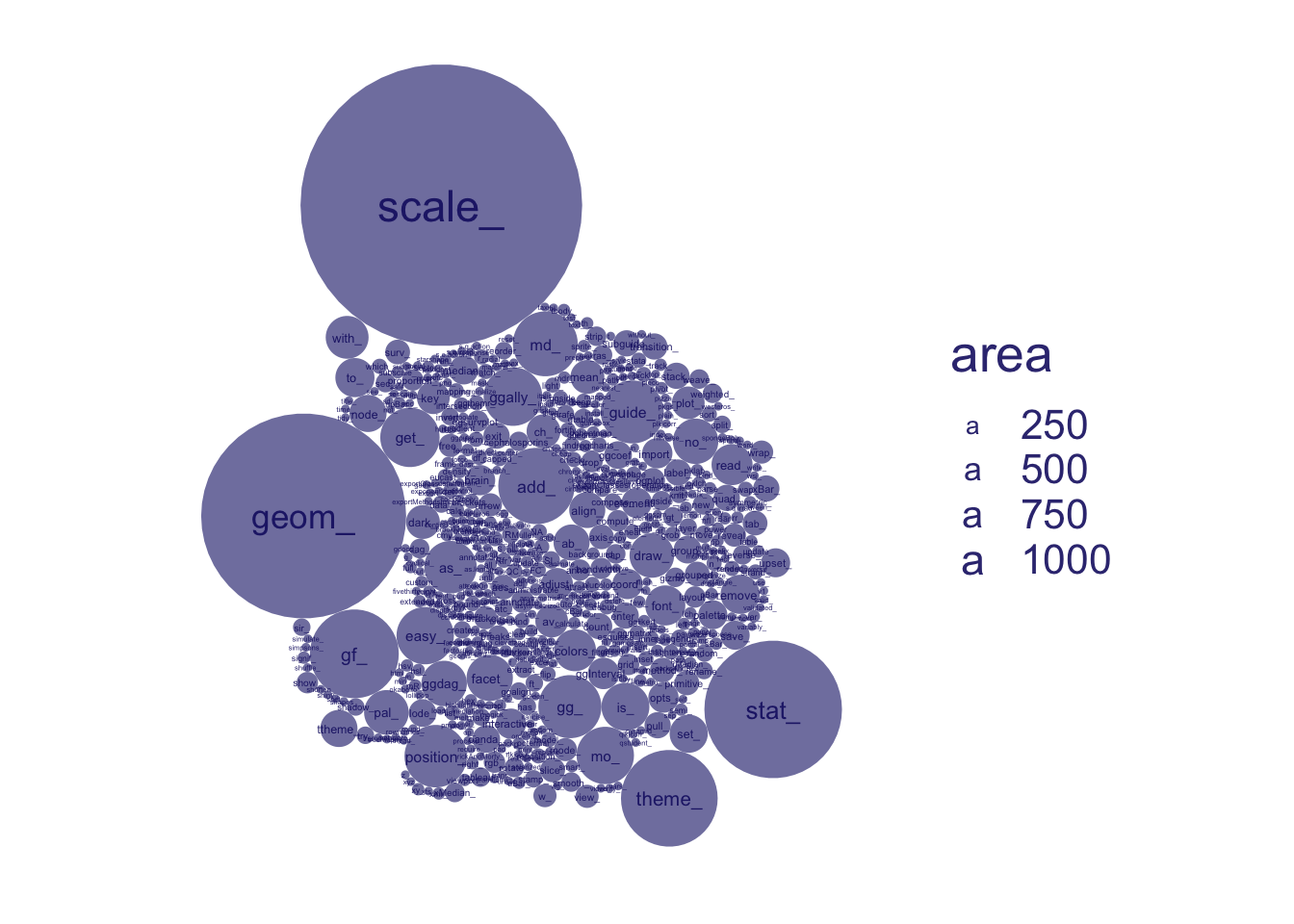
And we can look at what types of functions are exported, by looking at prefixes, using aes(id = prefix_short)
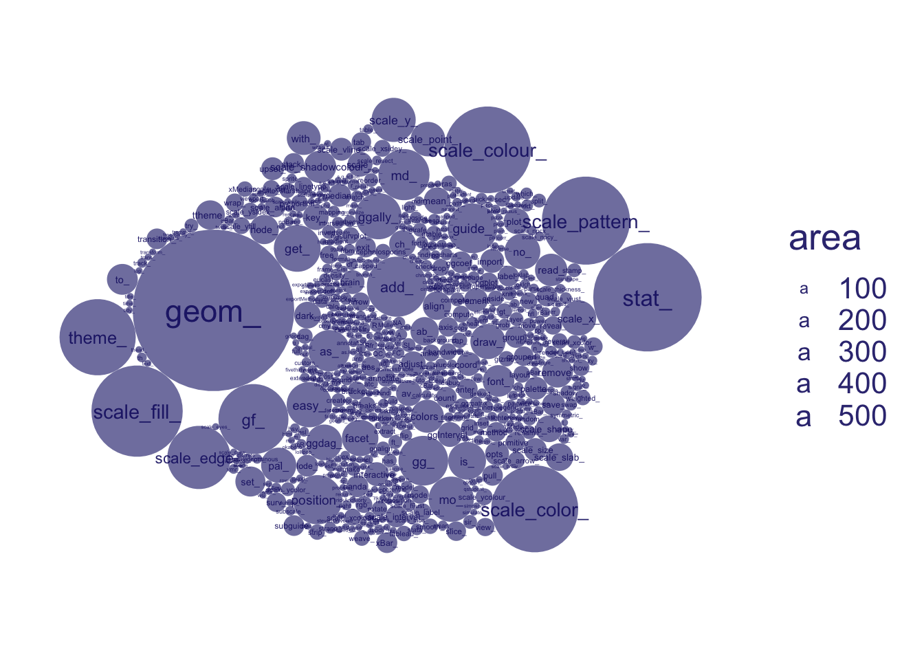
Disaggregating a little, to longer prefixes like scale_color, we get a more granular look at exported function types, using aes(id = prefix_long)
and we filter more popular prefixes, using data_filter(n() > 60 & !is.na(prefix_long), .by = prefix_long)
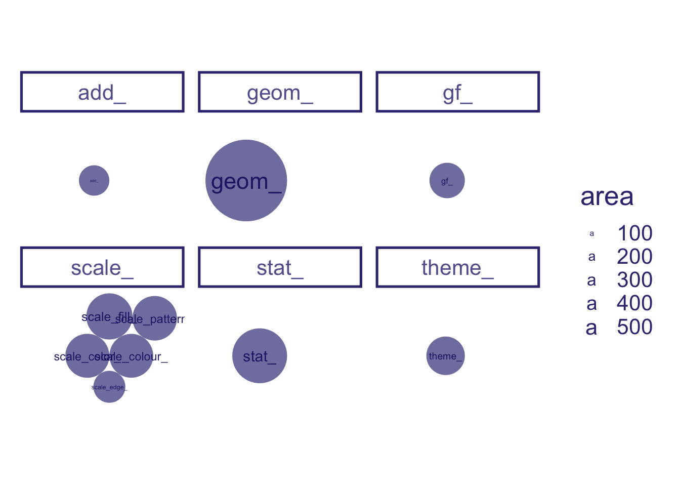
and break up our plot space by these prefixes, using facet_wrap(~prefix_short)
gf and add_ aren’t really in-grammar prefixes, using data_filter(!(prefix_short %in% c("gf_","add_")))
let’s look at top prefixes by user, using aes(id = user)
and look at the prolific authors in each of these areas, using data_filter(n() >= 10, .by = c(user, prefix_short))
and show them equally, using data_nest(c(user, prefix_short)) + scale_size(range = 1.7)
Here is the complete ‘conversation’ with the dataset!
ggplot(data = user_repo_fun) +# the data frame to be plotted is all the exported functions from the aes(id ="All exported functions") +# let's look at a count of all the exported functions first ggcirclepack::geom_circlepack() +# Using circlepacking, we automatically have circles size representing the number of observation, i.e. exported functions ggcirclepack::geom_circlepack_text() +# Of course this is hard to interpret without some kind of label. We use geom_circplepack_text to do this for uscoord_equal() +# and lets square up the circles ggchalkboard:::theme_glassboard() +# we'll add a themetheme(axis.line =element_blank(), axis.text =element_blank(), axis.ticks =element_blank()) +# And remove axes... aes(id = repo) +# First we ask what packages - github repository names - are presentaes(id = user) +# Then let's look at who is writing these exported functionsdata_nest(.by = user) +# an extender's an extender no matter how smallscale_size(range =1.75) +#shrink sizesdata_unnest() +data_nest(.by =c(user, repo)) +# extender by number of reposscale_size() +# back to default size scalesdata_unnest() +# back to record per extender (user)aes(id = prefix_short) +# And we can look at what types of functions are exported, by looking at prefixesaes(id = prefix_long) +# Disaggregating a little, to longer prefixes like scale_color, we get a more granular look at exported function typesdata_filter(n() >60&!is.na(prefix_long), .by = prefix_long) +# and we filter more popular prefixesfacet_wrap(~prefix_short) +# and break up our plot space by these prefixesdata_filter(!(prefix_short %in%c("gf_","add_"))) +#gf and add_ aren't really in-grammar prefixesaes(id = user) +# let's look at top prefixes by userdata_filter(n() >=10, .by =c(user, prefix_short)) +# and look at the prolific authors in each of these areasdata_nest(c(user, prefix_short)) +scale_size(range =1.7) # and show them equally